Industrial Controls Australia was landing contracts with major players like Unitywater and handling complex automation projects across Queensland and Tasmania — the kind of sophisticated work that required deep technical expertise and proven reliability.
But there was a disconnect. The visual identity that had served them well for three decades no longer reflected the calibre of work they were delivering. Their logo, featuring silver stars across maroon typography, had been perfectly adequate for a growing business, but now they were competing for million-dollar contracts where first impressions mattered more than ever.
The technical limitation was stark: the only version of their logo they possessed was a low-resolution file that couldn’t scale to the professional presentations these major projects demanded.
“When we first reviewed their materials, we found the logo wasn’t available in a format suitable for the kinds of high-end presentations they were preparing,” recalls the Spark team. “Rebuilding it became one of the first priorities to ensure their brand reflected the quality of their work and the scale of opportunities they were targeting.”
The Strategic Evolution
When Industrial Controls Australia first approached Spark, they had a specific goal: a professional capability statement that would better represent their work for major project bids. However, it quickly became clear that their visual identity needed to evolve alongside their growing market position.
The opportunity was significant. Here was a company with over 100 years of combined expertise in industrial automation, ISO certifications, and an impressive portfolio spanning Cross Laminated Timber plants to major water infrastructure. Their expertise was unquestionable; the challenge was ensuring their brand presentation matched that calibre.
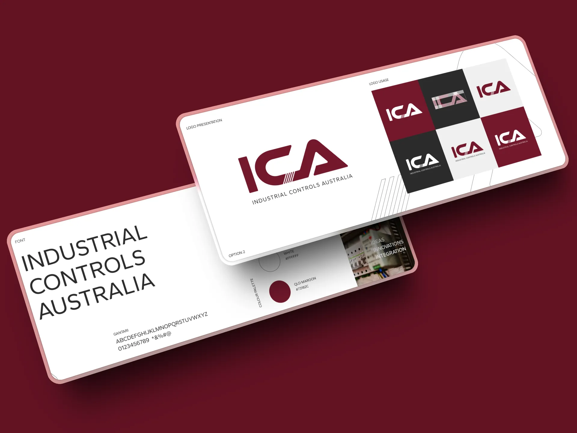
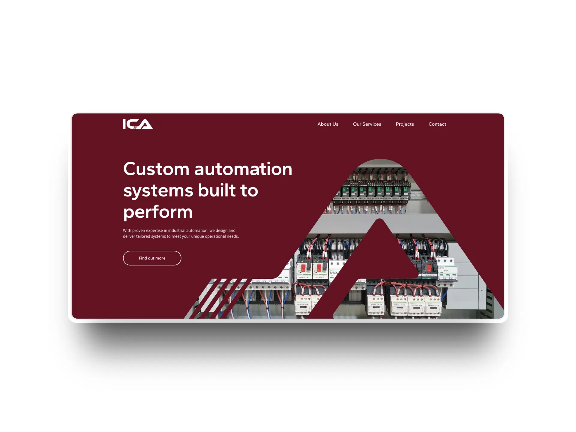
The client understood the importance of evolution while respecting the brand equity they’d built. After thirty years of business, certain elements held particular value. The maroon colour, in particular, was integral to their identity. “They were very committed to the maroon,” the team recalls. “We explored incorporating yellow and blue, then red, but they knew what represented their company best.”
The strategic challenge was clear: how do you elevate a successful brand to match its growing ambitions while preserving the elements that matter most?
Finding the Connection
The breakthrough came when the design team looked past the surface problems to understand what Industrial Controls Australia actually did. The new logo needed to reflect their expertise in automation and control systems while maintaining some connection to their heritage.
“We tried to do circuitry connections,” explains the team. “It was definitely about connection. That was the key insight.”
The solution preserved the maroon that held such value for Industrial Controls Australia, while elevating everything else to match their professional standards. The new logo maintained the connection between ‘I’, ‘C’, and ‘A’ through circuit-inspired lines that directly related to their expertise in automation and control systems.
One early concept explored an abstracted Southern Cross, celebrating their Australian heritage while suggesting precision and navigation. “We really liked it,” admits the design team, “but the client felt it might be too abstract for their industry context.” The final direction struck the perfect balance: sophisticated typography with subtle technical references that spoke to industry professionals while remaining accessible to broader audiences.
The transformation was significant yet respectful. The maroon they valued became a distinctive brand asset when paired with contemporary design principles and thoughtful application.
Words That Actually Work
While the visual transformation was striking, the real revolution happened in how Industrial Controls Australia talked about their work. Jeric, who tackled the copywriting for both the capability statement and website, faced a mountain of technical jargon that even industry insiders struggled to parse.
“Their old website and capability statement had so much information. However, they were too technical and hard for a lot of people to understand,” he explains. “What I did was make sure we were still showing their expertise while making sure all technical terms were explained in simple words.”
The shift was fundamental. Instead of leading with specifications and technical capabilities, the new messaging started with outcomes: “Smarter systems for safer, faster operations.” The technical depth was still there — essential for credibility with engineers and project managers — but it supported clear benefit statements rather than overwhelming them.
“We kind of want to emphasise the benefits or what they are offering, then go into the technical details,” Jeric explains. “So we have those big headings like ‘smarter systems for safer and faster operation’ that show what they’re really providing.”
The goal was to make their expertise more accessible by presenting it in a way that spoke clearly to decision-makers, without losing the technical substance behind it.
The Digital Foundation
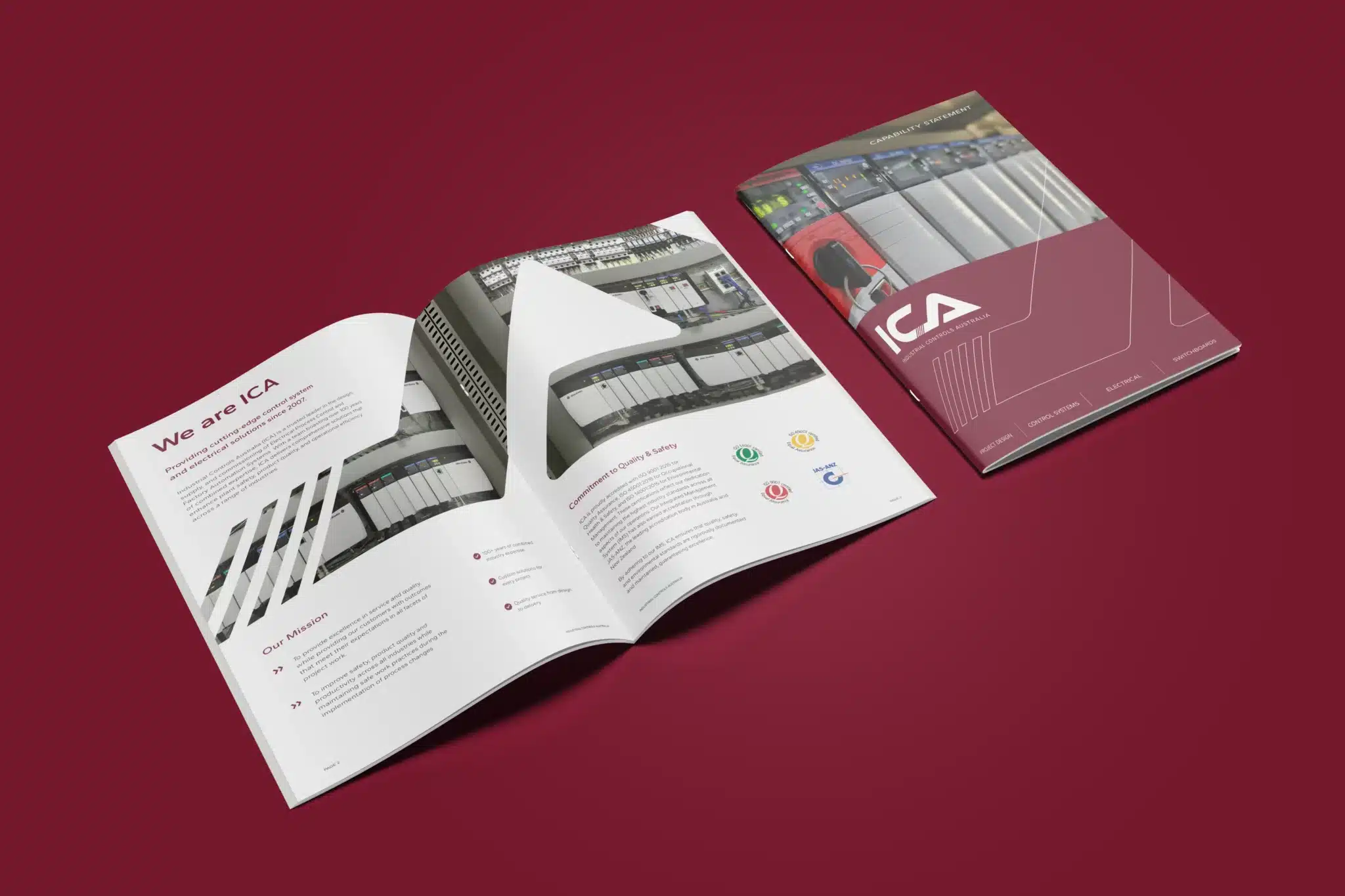
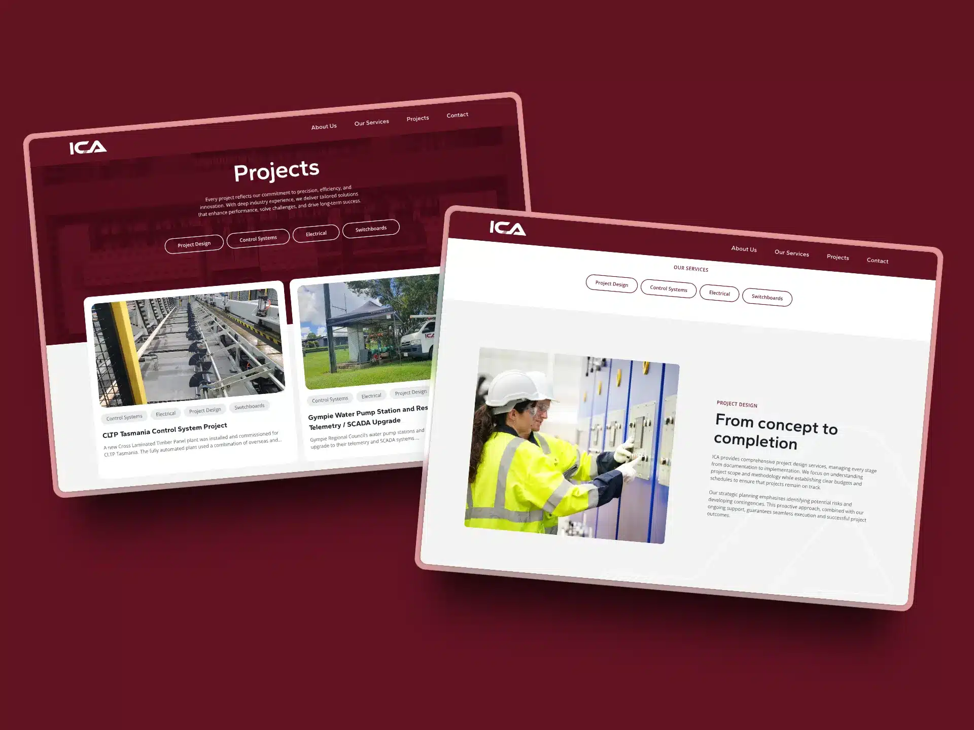
The capability statement became the testing ground for this new approach. Where the old document had been a dense technical manual, the new version told a clear story: established expertise, proven results, professional approach.
The visual treatment supported this narrative. Clean layouts, strategic use of the maroon colour as an accent rather than a dominating element, and professional photography created a document that felt as sophisticated as the systems they designed.
“They wanted it to feel connected to their technical expertise but more polished, more corporate,” the team noted.
The document successfully bridged the gap between technical credibility and commercial presentation.
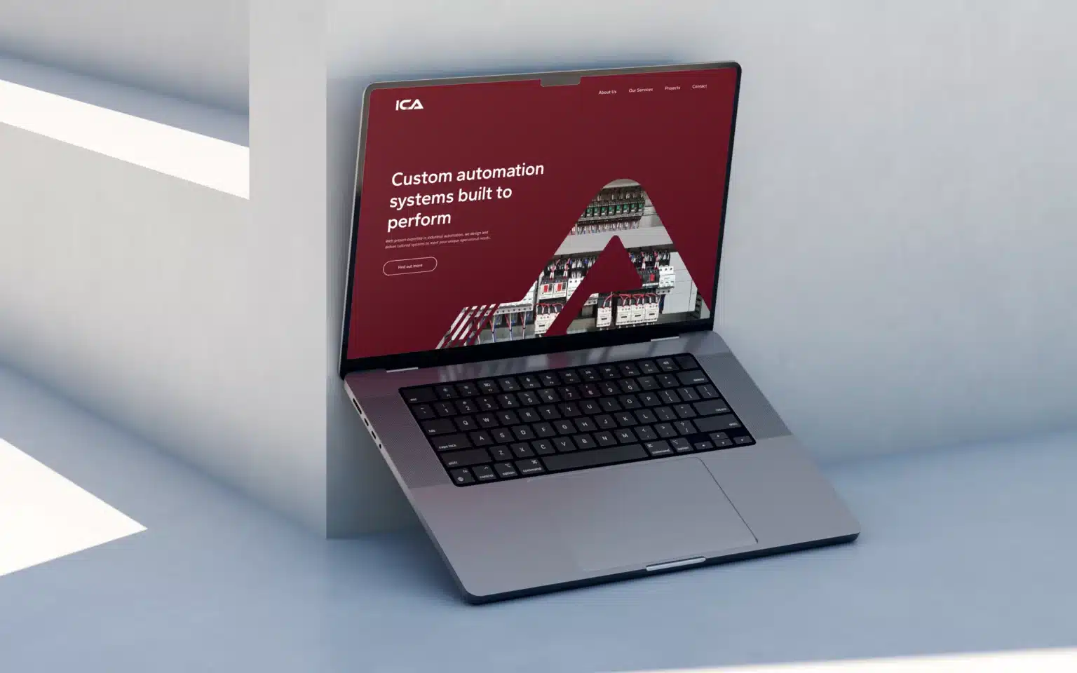
When it came time to extend this foundation into a website, the same principles applied. Barbora and Ha-ram’s development work included subtle animations that enhanced user experience without feeling gimmicky.
“As you scroll, the text and content fades in really gently,” the team explains. “It just gives it a little bit more movement, making it feel lighter as a user experience.”
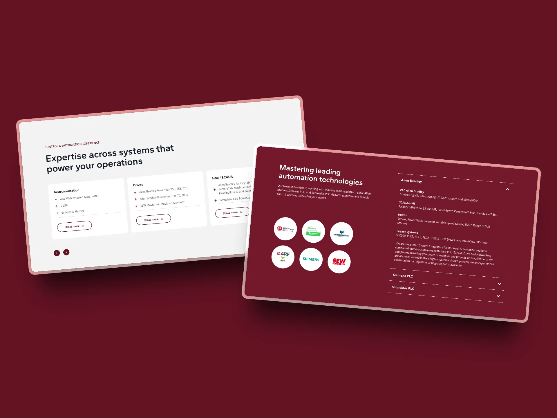
The technical challenge was significant: how do you present complex automation capabilities to multiple audiences — from procurement teams evaluating vendors to engineers assessing technical credentials — without losing either group?
The Image Problem
One area that needed particular attention was project photography. Like many technical companies focused on delivering excellence, Industrial Controls Australia’s project documentation prioritised function over presentation.
“Most technical companies capture their work with whatever’s at hand,” explains the team with understanding. “The focus is rightly on the project itself, but that doesn’t always translate to marketing materials.”
The solution required careful curation. The team created mood boards combining professional stock imagery with Industrial Controls Australia’s stronger project photos, ensuring visual consistency while authentically representing their work environments.
“It was quite collaborative,” recalls the project team. “They could evaluate each option and confirm ‘yes, that represents what we do’ and ‘that accurately shows our work environment.'” This partnership approach ensured the imagery told their story authentically while maintaining professional visual standards.
The final website balanced technical sophistication with accessibility, allowing visitors to dive as deep into specifications as needed while never losing the clear value proposition.
The Successful Transformation
The project took time to complete, primarily because of Industrial Controls Australia’s busy project schedule.
“They were really pleased with the outcome,” says the team. “There were times they couldn’t get back to us straight away because they were tied up with projects, but with consistent communication, we kept things moving and got everything over the line.”
Industrial Controls Australia now has a brand that matches their technical capabilities. The maroon colour that they had insisted on preserving became a sophisticated brand asset when properly applied. The new messaging hierarchy ensures their technical credibility enhances rather than overwhelms their commercial appeal.
The website serves as an effective business development tool, clearly communicating capabilities while maintaining the technical depth that industry clients expect. Most importantly, the brand now opens doors to the opportunities they’re already qualified to handle.
The transformation demonstrates how thoughtful brand evolution can respect existing equity while dramatically improving market positioning. Industrial Controls Australia’s brand finally reflects the sophisticated automation systems they design and implement.
Is your brand keeping up with your capabilities? Sometimes the biggest barrier to growth isn’t what you can do — it’s how you’re presenting what you can do. Our team understands the delicate balance between respecting heritage and embracing growth. Let’s talk about aligning your brand with your actual expertise.