When Dymocks Education approached Spark Interact in late 2022, they had a strong reputation in Australian tutoring — but their website wasn’t reflecting that. With over 140 years of heritage as a national brand, Dymocks had successfully expanded from bookselling into tutoring services across NSW and Victoria. Still, their digital presence, marked by dark visuals and a generic “Maximise your marks” headline, wasn’t resonating with their two distinct audiences: concerned parents and motivated students.
The challenge went beyond aesthetics. The site needed to speak to parents seeking support for their children, while also appealing to students aiming to excel. Dymocks also needed better data on how users were interacting with the site — and, more importantly, to turn more of those visits into tutoring enrolments.
I worked with Aimee, our Project Manager, and Ben, our Content Strategist, during the initial briefing to clarify the core challenge. Together, we identified two key audience segments visiting the site — each with a very different motivation.
“They’re either worried their child is struggling and needs help, or they’re looking for ways to help them aim higher and achieve better results.”
Uncovering the Real Challenge
What started as a website redesign quickly became something more strategic. In our early discovery sessions, it became clear that Dymocks’ main goal was to increase tutoring bookings. But achieving that required a more thoughtful approach.
The existing site focused too narrowly on remediation, overlooking the full emotional landscape of its audience. Students weren’t only chasing better grades; they were also dealing with peer pressure, anxiety about their future, and a need for confidence. Parents, meanwhile, were thinking beyond academic performance. They were concerned about their child’s wellbeing and long-term growth.
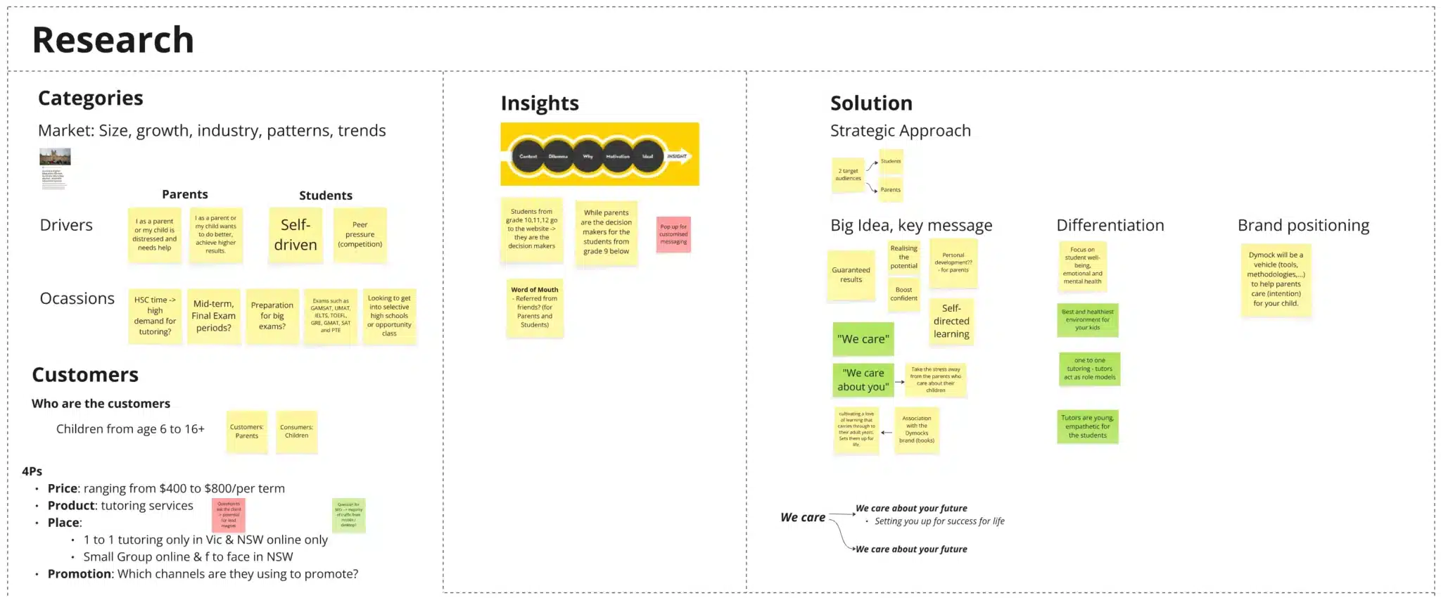
The team dove deep into market research, analysing everything from competitor positioning to customer decision-making patterns. We mapped out the customer journey, identifying key drivers and occasions for seeking tutoring, from HSC preparation to concerns about falling behind. Importantly, we discovered that word of mouth was a crucial factor for both parents and students, which would later inform our decision to prominently feature testimonials and Google reviews.
We discovered a crucial insight that would shape our entire approach: while students from grades 3-16 were the service users, the decision-makers shifted dramatically at grade 10.
“Students from grade 10, 11, 12 go to the website -> they are the decision makers. While parents are the decision makers for the students from grade 9 below.”
This revelation meant we couldn’t just create two landing pages and call it done. We needed a sophisticated approach that recognised the emotional and practical needs of both audiences while respecting their different roles in the decision-making process. The insight that older students were self-driven by peer pressure and competition, while younger students’ parents were motivated by either distress or ambition, would inform every design and content decision that followed.
Phase 1: Building the Strategic Foundation
Our research phase revealed several critical insights about the tutoring market. Dymocks was competing against established players like Matrix Education and Kip McGrath, each with their own positioning. But we also discovered something that would become central to our strategy: while competitors focused heavily on academic results, there was a gap in addressing the emotional wellbeing of students.

The research showed that beyond grades and study workload, students were deeply concerned about mental health, peer pressure, anxiety, and external perceptions. Academic performance was only part of the picture — students also wanted to feel supported, understood, and connected. Our research also revealed that students valued peer connection and wanted to learn from other high achievers, which would later influence the decision to emphasise Dymocks’ small group tutoring options alongside one-to-one support.
From the start, I knew we had to focus on student wellbeing and create the best, healthiest environment for each learner.
I worked closely with Ben to turn those insights into a clear brand message. Together, we developed the concept of “We Care,” a positioning that would set Dymocks apart from the results-only focus of its competitors. That collaboration between strategy and design was key to the project’s success.
The Spark Interact team stayed focused throughout the process, from research to implementation, on one guiding idea: tutoring should support the whole student, not just their grades.
Phase 2: Designing the Solution
Armed with our research, we presented two wireframe concepts to the Dymocks team:
Option 1 featured a straightforward approach with images showcasing different age groups and tutoring styles. While clean and simple, it didn’t fully leverage our insights about the different decision-making dynamics.
Option 2 proposed linking to specific landing pages for each age group, allowing us to tailor messaging precisely. For primary school and years 7-10, we could speak directly to parents’ concerns. For years 11-12, we could address students’ ambitions and anxieties directly.
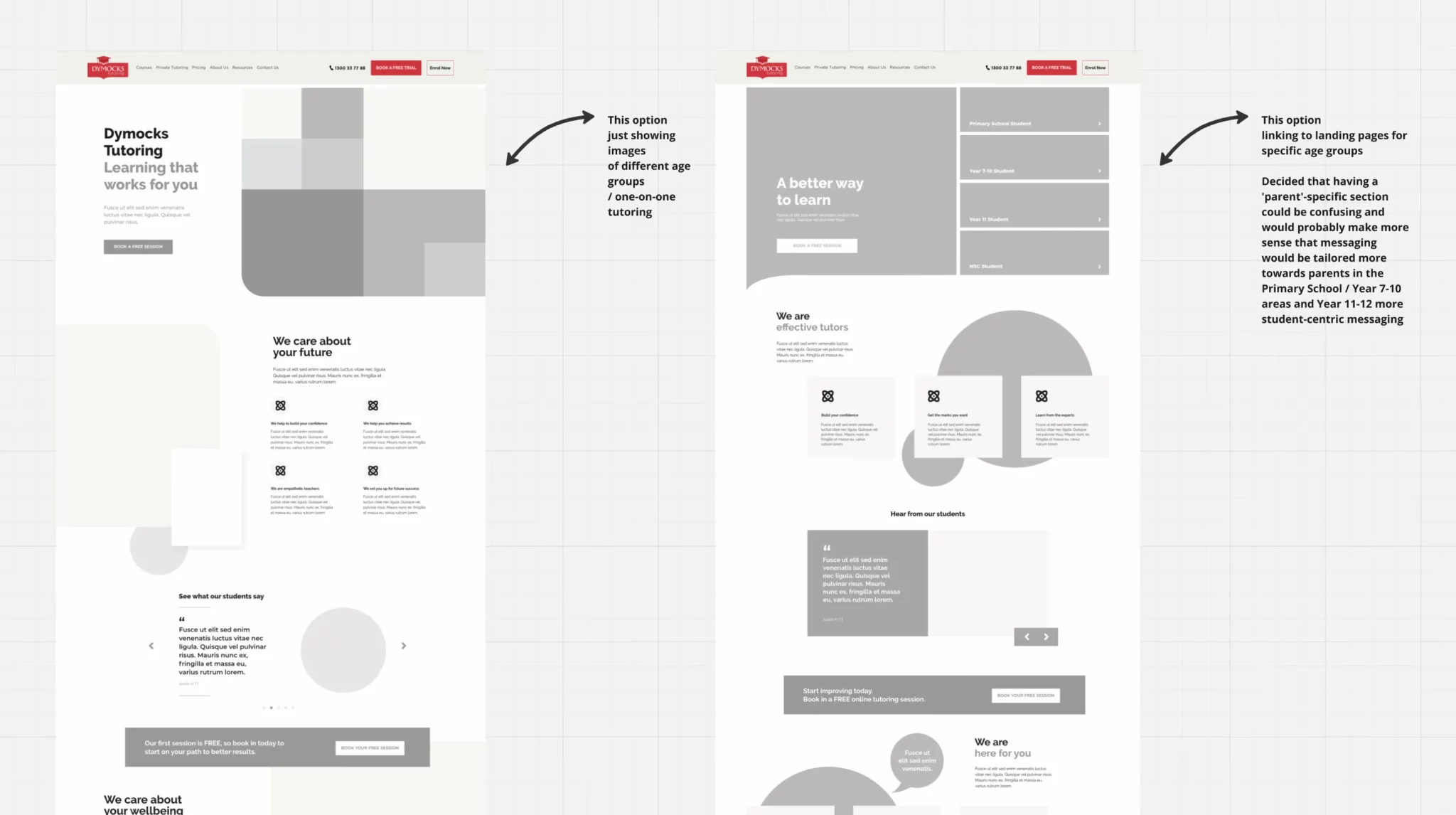
One point that came up during internal discussions was the importance of how the messaging was framed across different age groups:
“We decided that having a ‘parent’-specific section could be confusing, and it would make more sense to tailor messaging towards parents in the Primary School and Years 7–10, and towards students in Years 11–12.”
The client wisely chose Option 2, recognising its potential for more nuanced communication.
Phase 3: Crafting the Message
This is where Ben’s content expertise truly shone. Instead of leading with the typical tutoring promises of “better grades” or “exam success,” he developed a tagline that captured both our strategic insight and Dymocks’ unique value proposition:
“Learning That Works.”
The strength of this line was in its simplicity and versatility. For stressed parents, “works” meant effective, proven results — their investment would pay off. For ambitious students, it implied smarter, more efficient study. And for everyone, it promised something that actually fits into real life, addressing the insight that “the answer to better performance at school isn’t always more school.”
Ben crafted messaging that evolved naturally through the customer journey:
- “We care” (establishing empathy and connection)
- “We care about you” (personalising the relationship)
- “We care about your future” (expanding the vision beyond immediate results)
The messaging was shaped by strategic copywriting grounded in real insight, clearly reflecting Dymocks’ approach. Where competitors promised grades, Dymocks promised to care about the whole student journey. The message resonated because it was grounded in genuine insight about what parents and students actually needed to hear.
Phase 4: Bringing It to Life
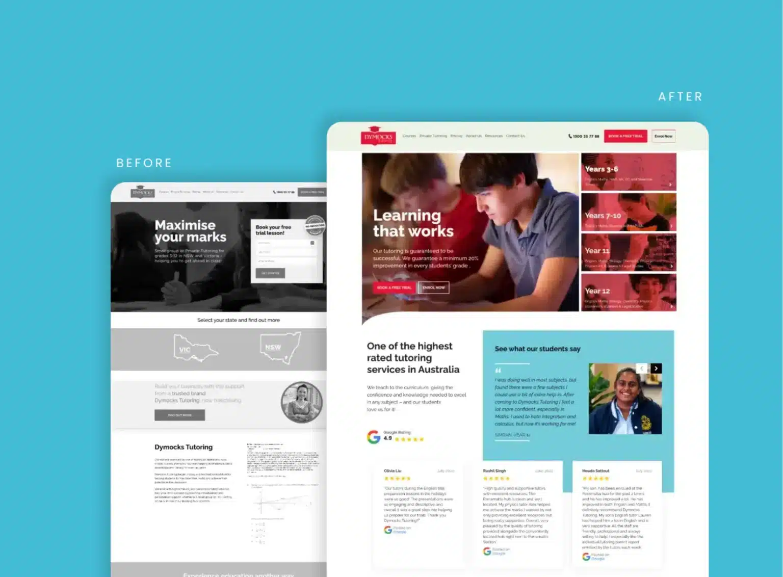
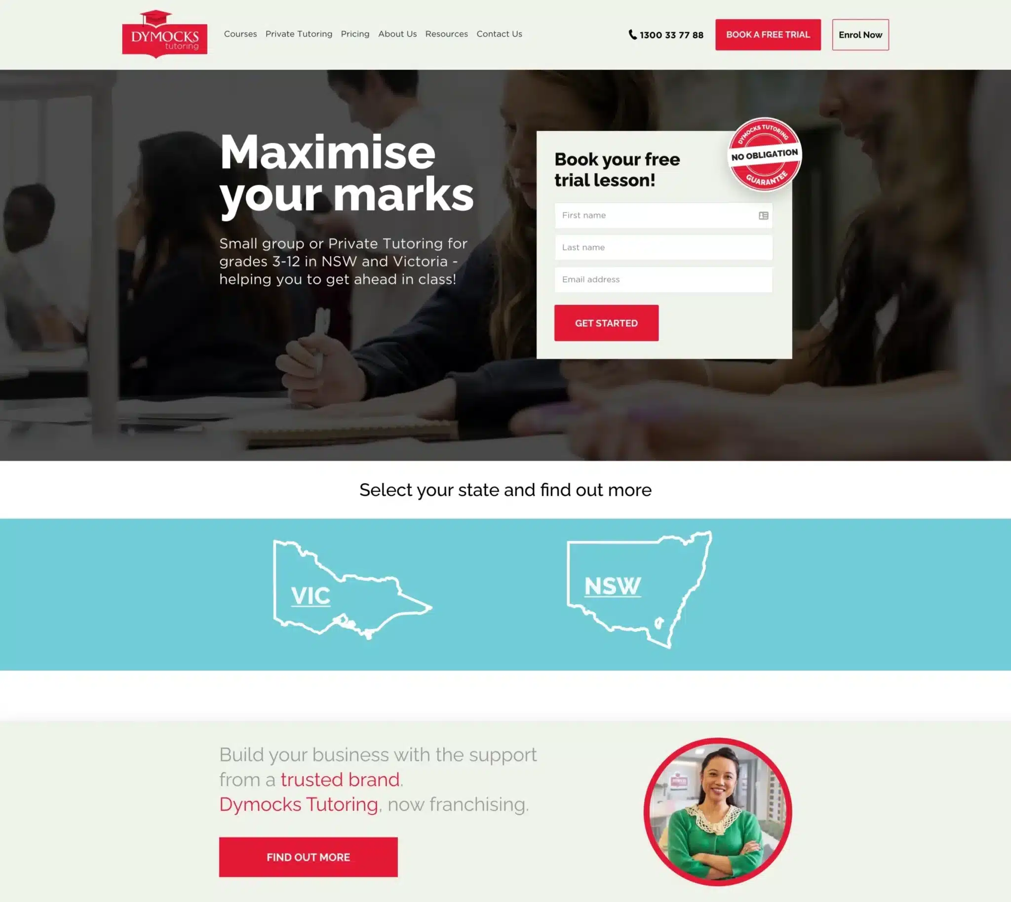
The transformation from old to new was nothing short of remarkable. Where the original site featured a dark, impersonal hero image with the generic “Maximise your marks” headline, I introduced warmth and humanity through a new design. The hero section now showed a real student engaged in learning, immediately creating that emotional connection our research had identified as crucial.
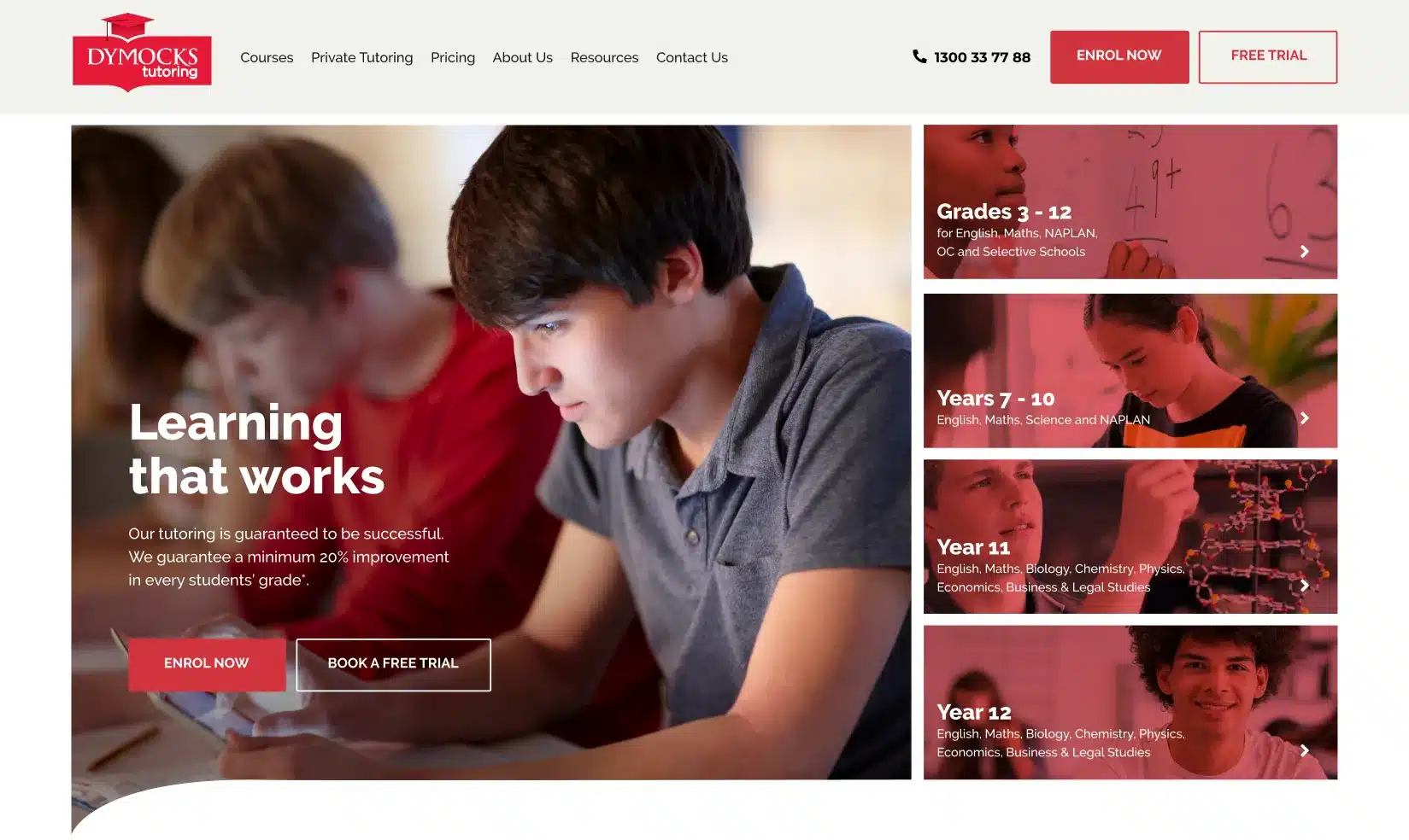
“Learning that works” replaced the cold promise of maximising marks. Below it, Ben’s copy confidently stated: “Our tutoring is guaranteed to be successful. We guarantee a minimum 20% improvement in every student’s grade.”
The visual hierarchy was completely reimagined. Instead of forcing visitors to immediately choose their state, the new design presented four clear pathways on the right side of the hero section — Years 3-6, Years 7-10, Year 11, and Year 12. Each section featured age-appropriate imagery and messaging, making it instantly clear which path to follow. The prominent “Book a Free Trial” and “Enrol Now” buttons replaced the sterile form that had dominated the old hero section, making the first step feel less intimidating and more inviting.
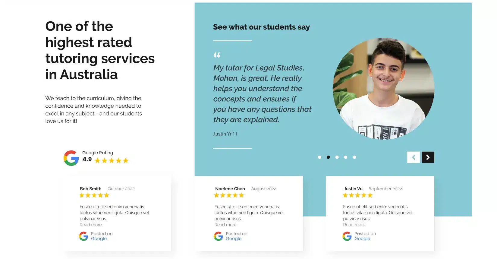
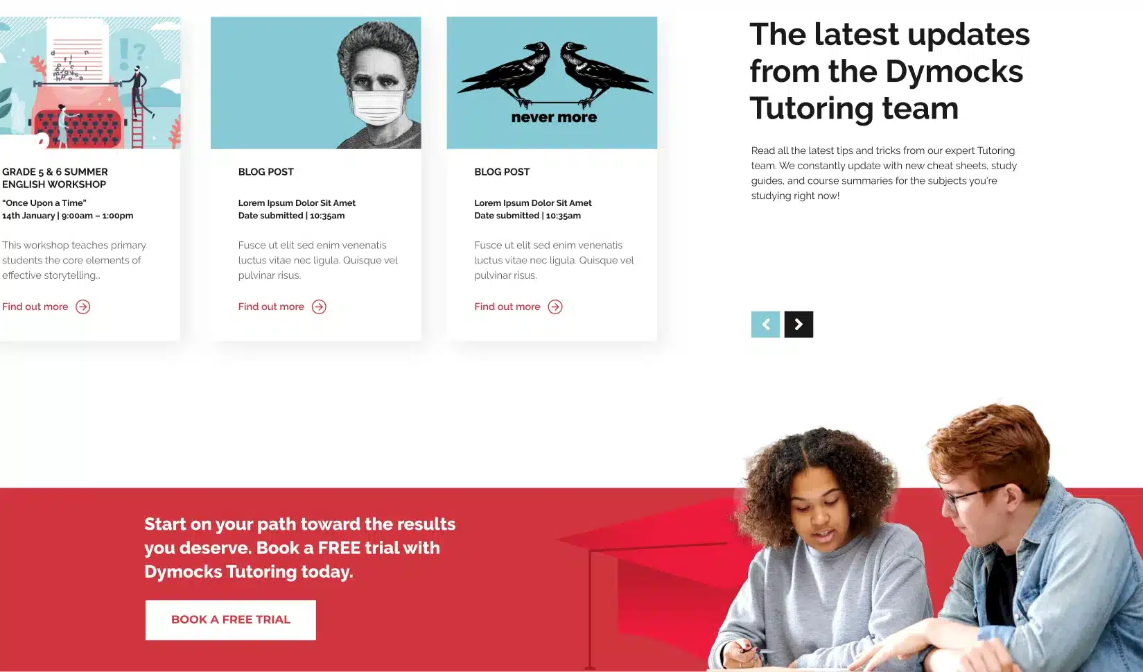
But perhaps the most powerful addition was the social proof. The new “See what our students say” section showcased real testimonials alongside Google’s 4.9-star rating. Where the old site buried credibility indicators, the new design celebrated them. Students like Olivia Liu shared how “The presentations were so engaging and descriptive,” while parent Houda Sattout noted her son’s improvement in both English and Maths. The transparency extended to pricing and service options, making it easier for parents to understand their investment without having to dig through pages of content.
The state selection, previously a prominent barrier, was elegantly minimised without losing functionality. The franchising information found its proper place in the site architecture rather than competing for attention with the primary conversion goals.
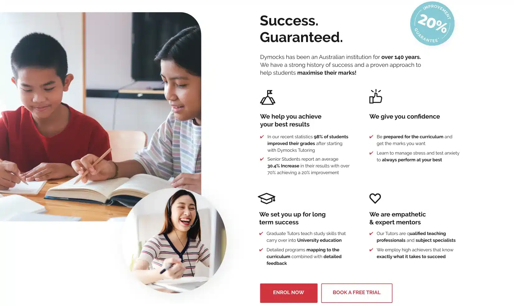
At the bottom of the page, the “Success. Guaranteed.” section reinforced Dymocks’ confidence with specific promises: “We help you achieve your best results” and “We give you confidence.” This claim was supported by real results, with data showing 98% of students improved their grades after starting with Dymocks.

The Outcome: Transformation in Action
When the new website launched on January 11, 2023, the results were immediate and impressive. The Google Analytics user acquisition data from the first month (January 11 – February 11, 2023) showed significant improvements across all key metrics compared to the same period before the launch (November 11 – December 11, 2022):
- Active users increased by 14.3% (from 18K to 21K) — more people were finding and engaging with the site
- New users grew by 12.6% (reaching 20K) — the improved messaging was attracting fresh audiences
- Average engagement time rose by 12.8% (to 1m 24s) — visitors were finding content that resonated
But beyond the numbers, the transformation was evident in every pixel. The cold, impersonal “Maximise your marks” approach had given way to a warm, human-centred experience. Real student testimonials replaced generic promises. Clear navigation paths replaced confusing state selection barriers. And most importantly, the entire site now radiated the care and understanding that our research had identified as Dymocks’ key differentiator.
Parents landing on the site could immediately see this wasn’t just another results-factory tutoring service. The prominent display of Google’s 4.9-star rating, combined with testimonials from both students and parents, built trust from the first moment. Students could see themselves in the photography and messaging, recognising Dymocks as partners in their journey rather than just another pressure point.
One of the most memorable lines on the homepage summed it up clearly:
“The answer to better performance at school isn’t always more school.”
This single line, crafted by Ben, encapsulated everything our research had revealed. It acknowledged the pressure students face while positioning Dymocks as the tutoring service that gets it — that understands success isn’t just about cramming more information, but about finding approaches that actually work for each student.
Looking Forward
The Dymocks Education project showed how strategic thinking, grounded in research and empathy, can transform a digital presence. What began as a generic tutoring website became a platform that speaks directly to both parents and students. Not just about results, but about care, clarity, and confidence.
Since launch, “Learning That Works” has continued to guide Dymocks’ growth in a competitive market. The integration of social proof, clear navigation, and emotionally intelligent messaging has reshaped how they show up online.
For us at Spark, this project was a reminder that great digital solutions start with understanding people — their goals, their pressures, and their decisions. That human insight will continue to shape how we work with clients moving forward.