Elevating Legal Excellence Through Strategic Rebranding
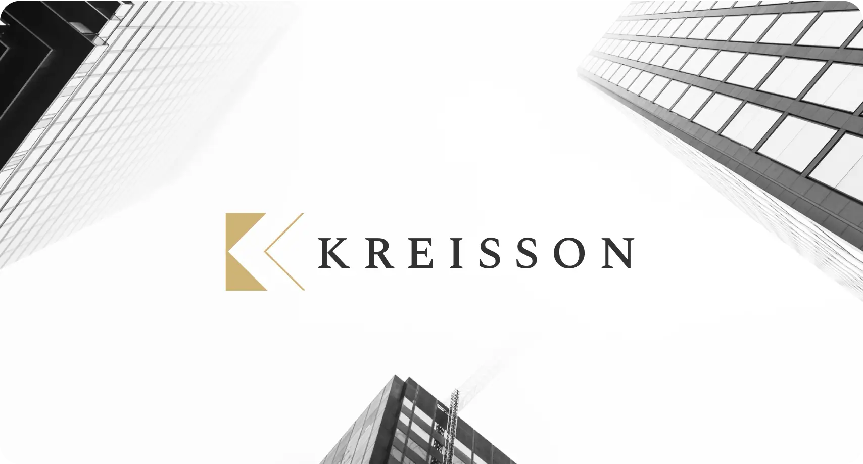
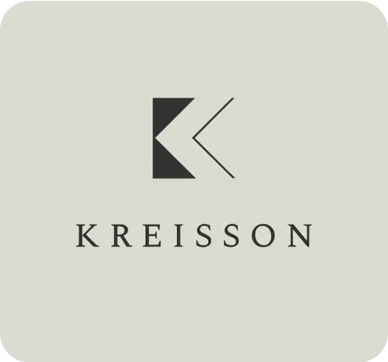
Kreisson
Scroll to explore
Year
2025
WHAT WE DID
Brand Strategy & Identity Design
Website Design
Website Development
Content Migration
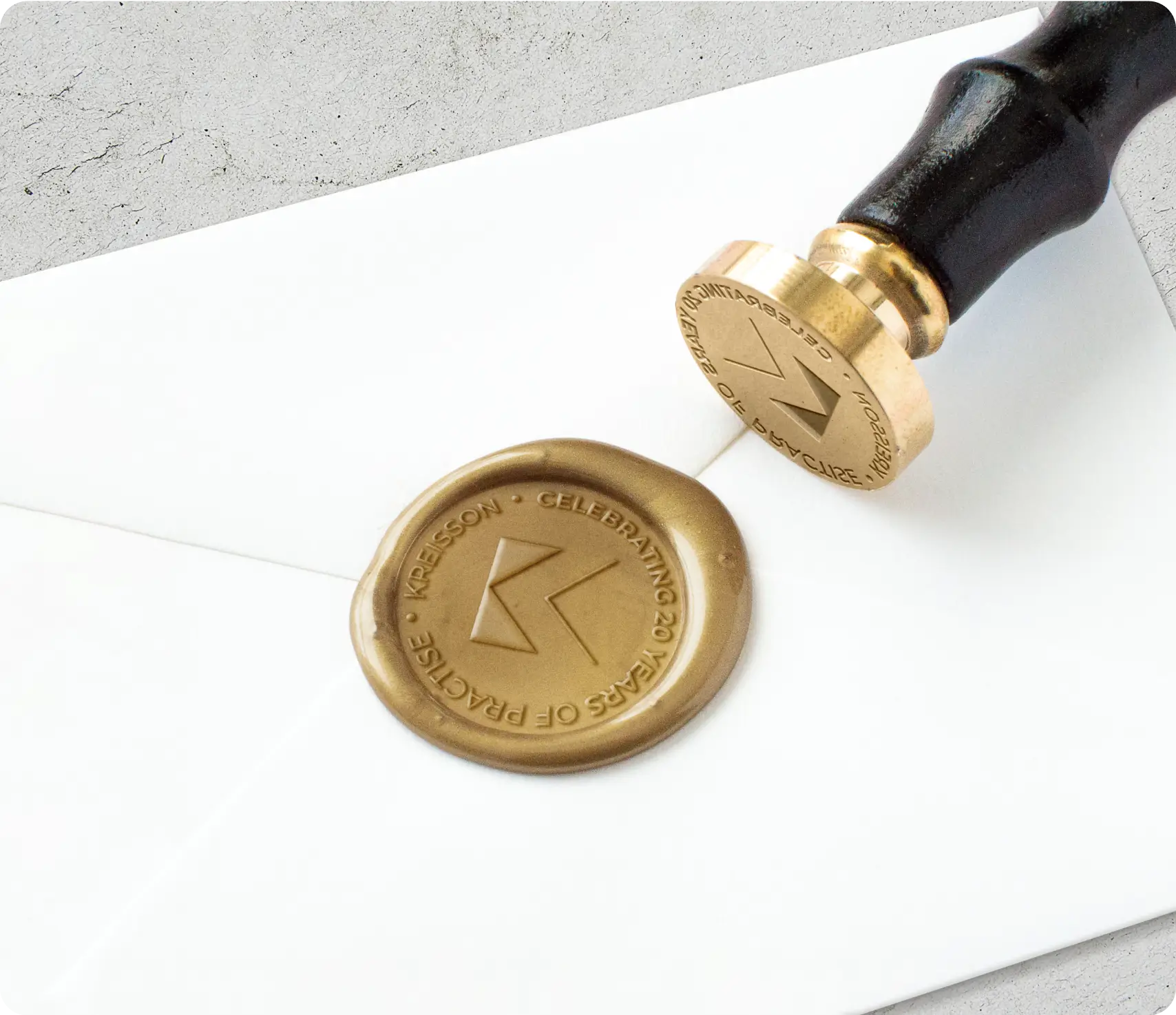
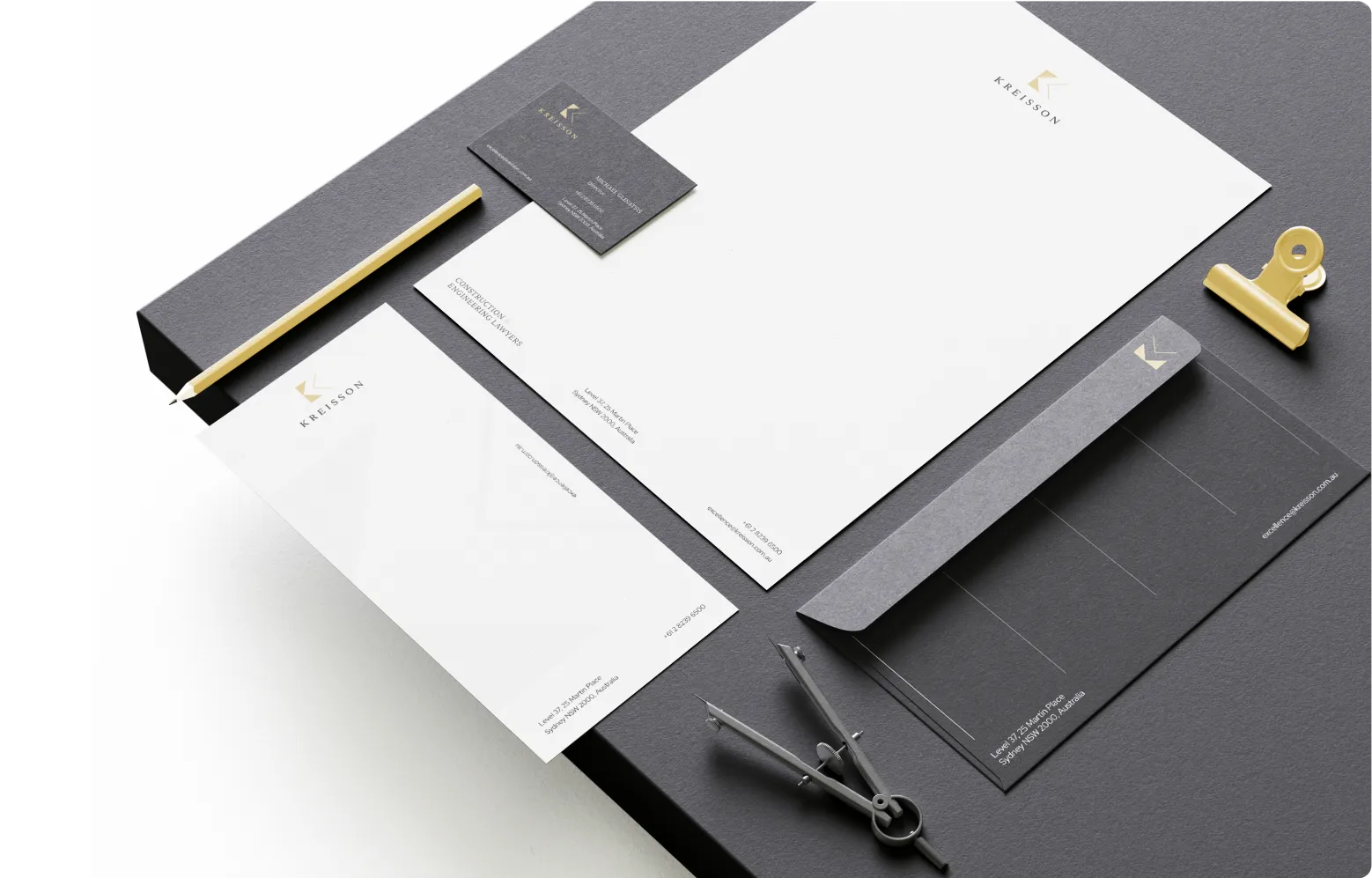
Stationery Design
Template Document Design
Business Card Design
Kreisson
Kreisson, a leading construction and engineering law firm celebrating over 20 years of expertise, approached Spark Interact seeking a complete digital transformation. With their 25th anniversary approaching, they wanted to modernise their brand identity and create a website that would reflect their prestigious position whilst maintaining approachability in the competitive legal landscape.
Kreisson faced several critical challenges that required a sophisticated solution:
Brand Identity Crisis: After working with multiple agencies and receiving preliminary mockups they weren’t satisfied with, Kreisson needed a brand that would capture their unique positioning. The firm’s name, derived from the Greek word meaning “better than,” required visual representation that balanced prestige with approachability.
Technical Migration Complexity: The existing website contained over 300 blog posts built with custom fields and Advanced Custom Fields technology. Moving this content to a new platform whilst maintaining functionality and SEO value presented significant technical challenges.
Market Positioning: As specialists in construction and engineering law, Kreisson needed to differentiate themselves from competitors like Vincent Young, whose “tacky” gold-heavy branding approach they specifically wanted to avoid.
The Challenge
Our Strategic Solution
Brand Identity & Visual Design
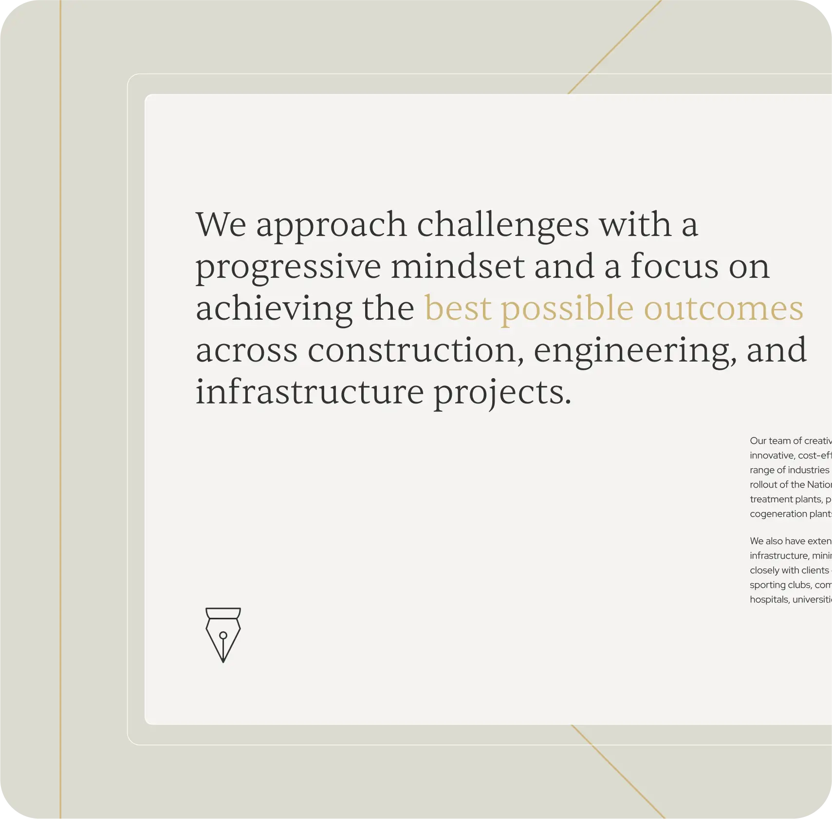
Our creative process began with understanding Kreisson’s core values and market position. The name’s Greek origins meaning “better than” became central to our brand strategy, reflecting their commitment to excellence without appearing arrogant.
Colour Palette Evolution: We refined their existing black, white, and gold palette, introducing a sophisticated grey-green accent colour to create a more nuanced, professional appearance. This moved away from the stark black and yellow combination whilst maintaining the prestige associated with gold accents.
Logo Development: The logo design process required multiple rounds of refinement. Whilst the initial brand direction was well-received, achieving the perfect balance between structural elegance and accessibility took careful iteration. The final design maintained the sophisticated colour scheme with simplified execution.
Brand Positioning: We developed a visual identity that spoke to both the construction industry’s structural nature and the legal profession’s requirement for trust and authority. Every design element reinforced the concept of “building” – both in construction and in legal solutions.
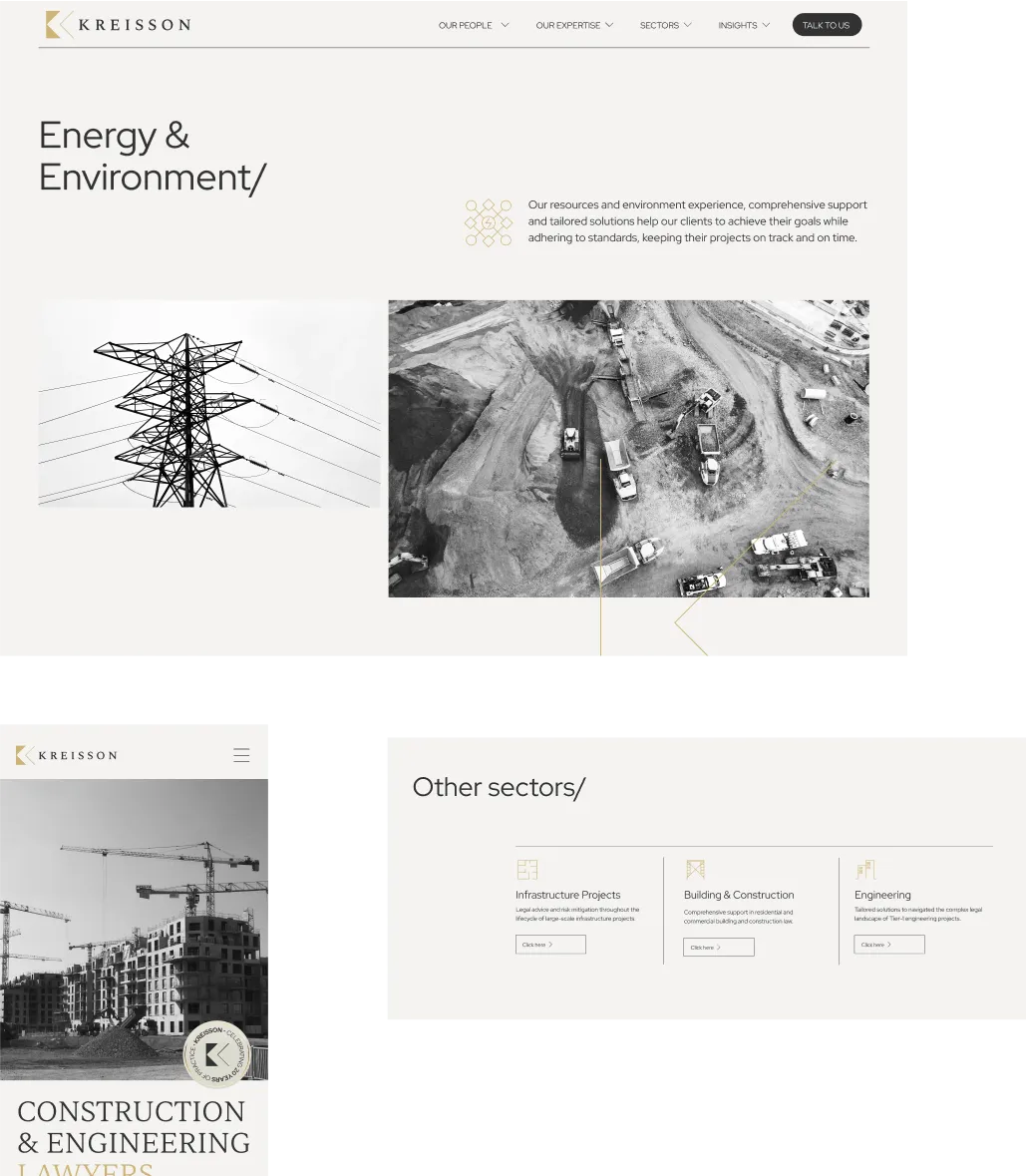
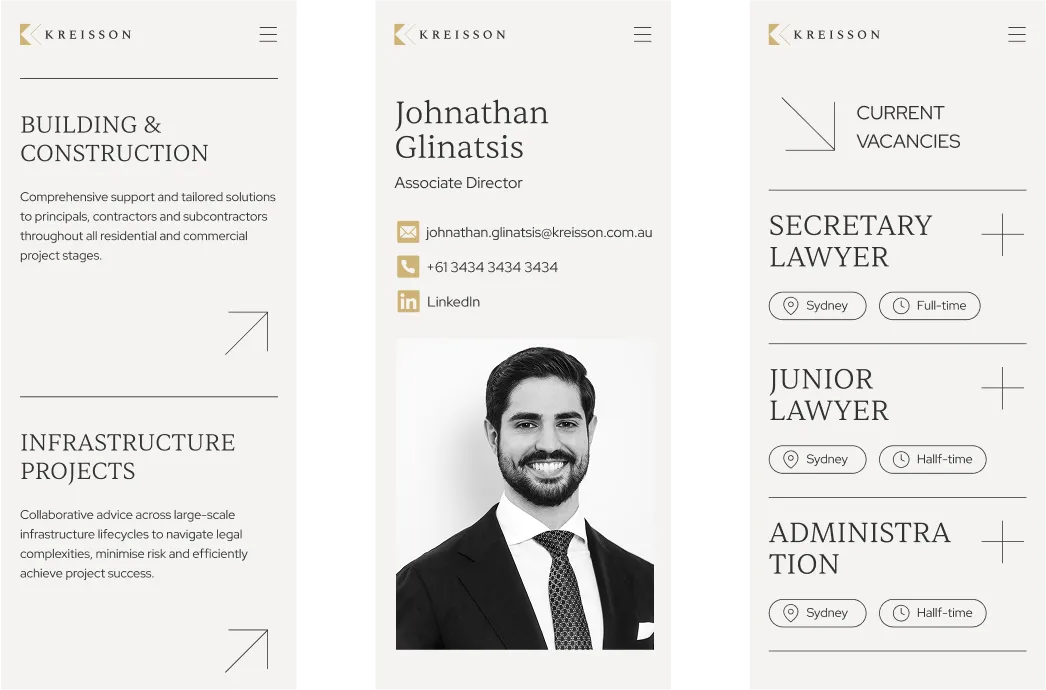
Website Design & Development
Typography & Animation: The website heavily featured custom typography with flowing animations that brought the text to life. Linear elements derived from the logo created visual continuity throughout the site, giving users the impression of construction and building – perfectly aligned with their target market.
Technical Excellence: Our development team created smooth, lightweight animations using custom code rather than plugins. This approach ensured optimal site performance whilst delivering the sophisticated visual effects that reflected the firm’s attention to detail.
User Experience: The design balanced the need to convey prestige (important in the legal sector) with approachability, ensuring potential clients felt welcome whilst understanding they were engaging with industry experts.
Complex Data Migration
Technical Migration Process: Moving 300+ blog posts from the old platform required extensive custom field mapping. The previous site used Advanced Custom Fields, but we upgraded to Jet Engine for enhanced functionality and design flexibility.
Mapping & Structure: Like “taking parts from a Honda car and assembling them into a Mercedes,” we recreated all custom fields on the new site and carefully mapped data relationships for team members, authors, titles, and content structure.
Timeline Management: The migration itself took approximately two hours, but the mapping and preparation process extended over three days to ensure no content was lost and all functionality was preserved.
Results & Impact
Seamless Launch: The website went live without technical issues, earning client praise for the smooth transition process. The responsive support provided post-launch reinforced the positive client experience.
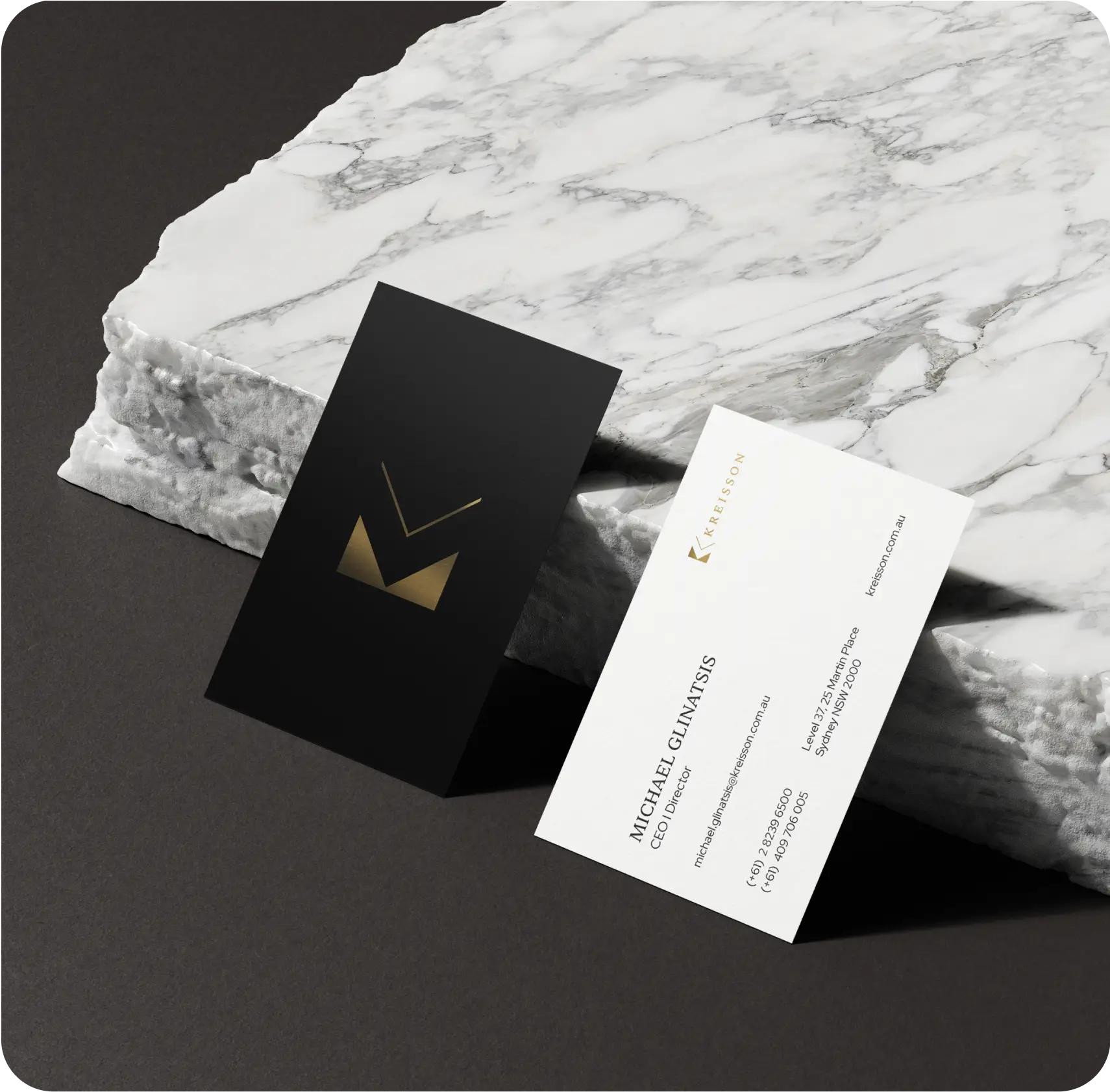
Premium Materials: The rebrand extended to high-quality business cards featuring foil debossing on textured stock, creating a tangible representation of the firm’s elevated positioning.
Client Satisfaction: Michael and the Kreisson team expressed complete satisfaction with the final result, particularly appreciating how the brand captured their unique market position whilst remaining approachable.
Award Recognition: The website was submitted for industry recognition, advancing to nominee status for “Site of the Day” awards, demonstrating the quality of design and development work.