Web Design
Web Development
When the Carbon Farming Foundation approached Spark Interact, they were already doing incredible work helping Australian landholders establish carbon farming projects. But their website told a different story entirely — one of confusion rather than clarity, complexity rather than accessibility. The foundation needed a digital transformation that would reflect their expertise while making carbon farming accessible to farmers who might be hearing about it for the first time.
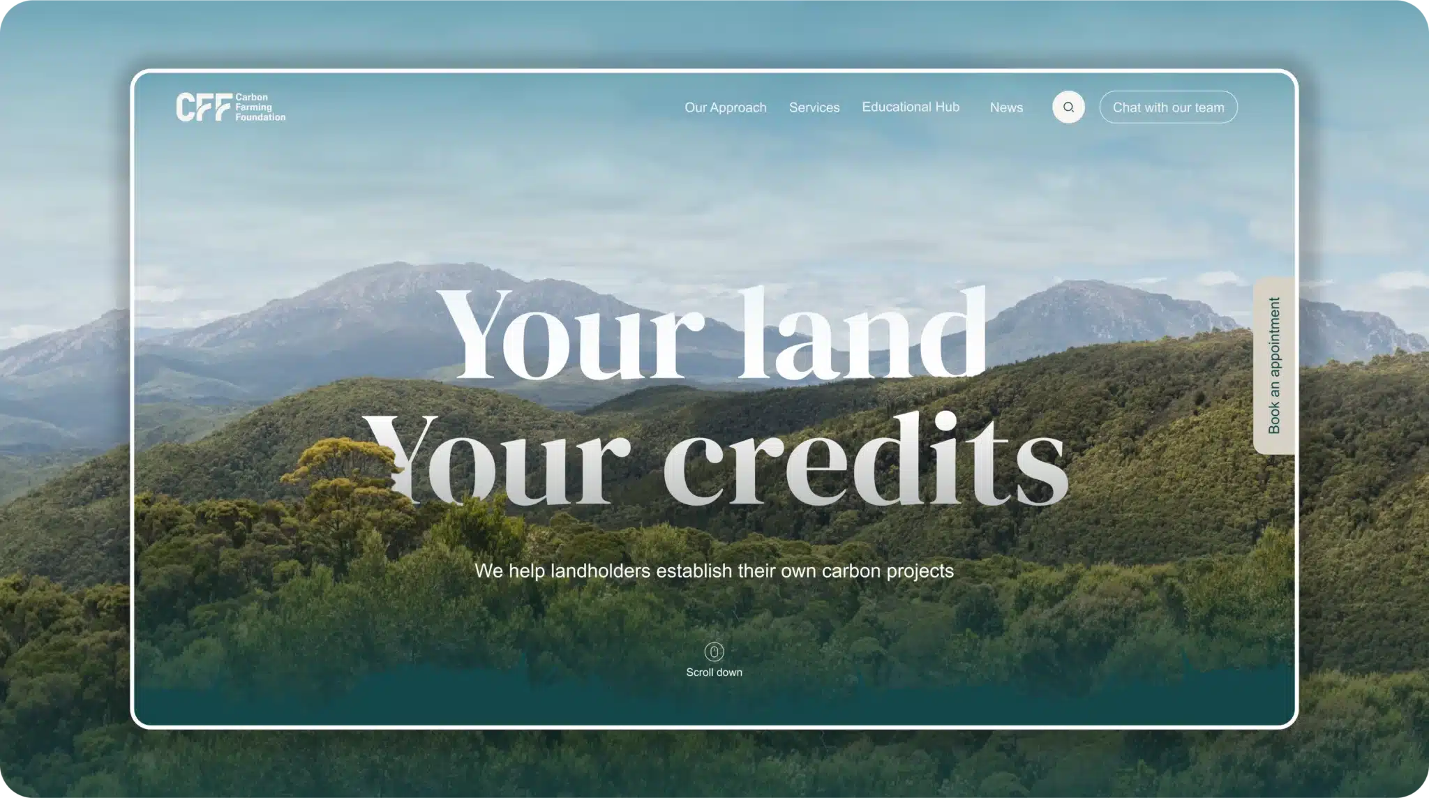
The Carbon Farming Foundation faced a perfect storm of digital challenges that many purpose-driven organisations know all too well. Their existing website was a maze of valuable information buried in hard-to-find corners, with navigation that left users more lost than informed. Meanwhile, their brand identity consisted of little more than a limited color palette of similar tones that lacked contrast, and an insistence on using Arial throughout.
But the real challenge wasn’t technical — it was human. The site needed to welcome farmers and landholders who might be hearing about carbon farming for the first time, guiding them through complex concepts without overwhelming them with jargon. All while working within an exceptionally tight timeline that demanded efficient collaboration and quick decision-making.
“The first two or three meetings were just about navigation and organising what went where.”
Ha-Ram Woo, UX Designer
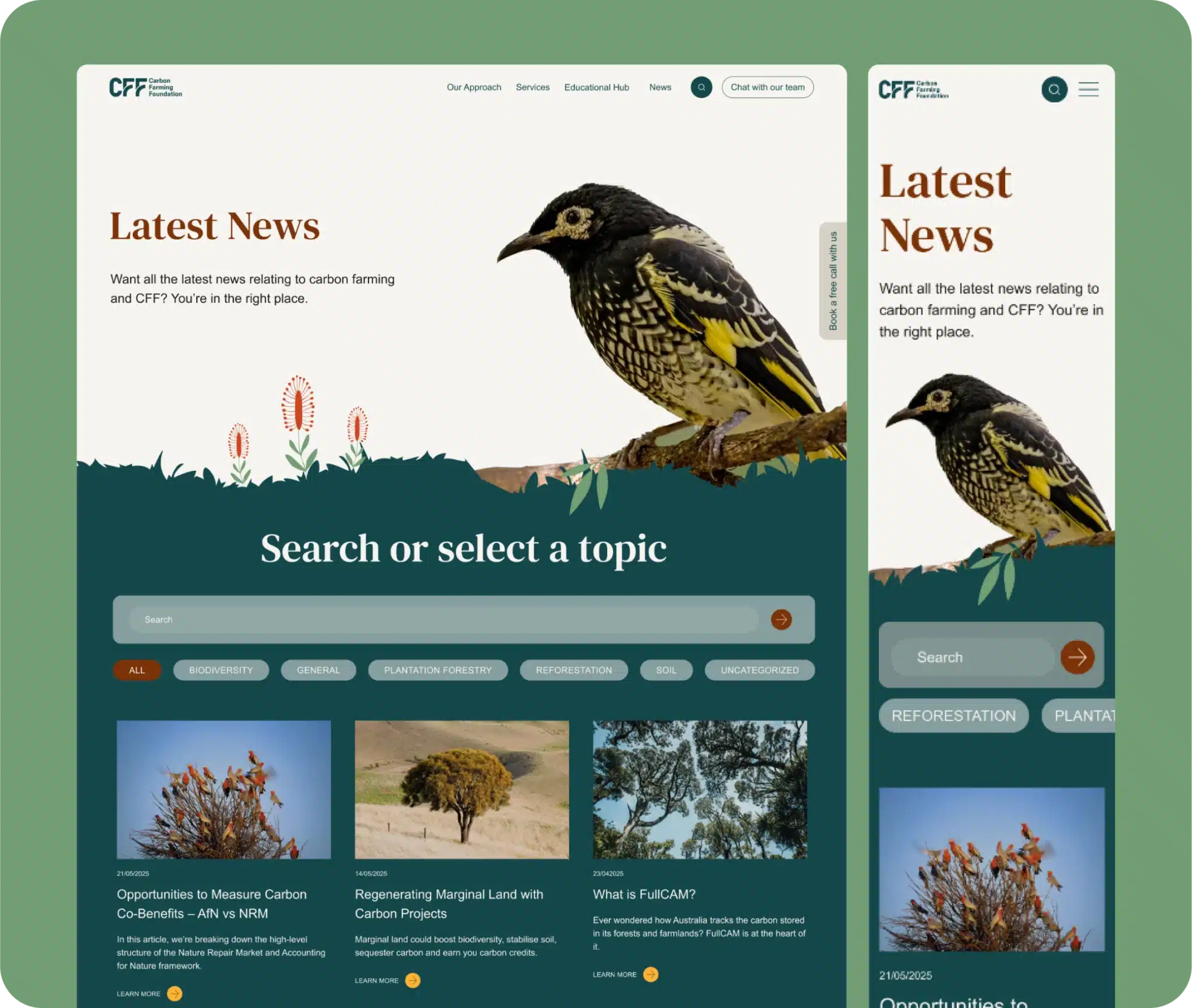
The transformation began with extensive wireframing and content strategy sessions. Rather than trying to reorganise the existing chaos, we started fresh — mapping out a user journey that would educate visitors while naturally guiding them toward booking consultations.
The breakthrough came when we developed a mega menu structure that could logically categorise all that valuable information. Think of it as creating a clear path through a dense forest of knowledge, where each step builds understanding and confidence.
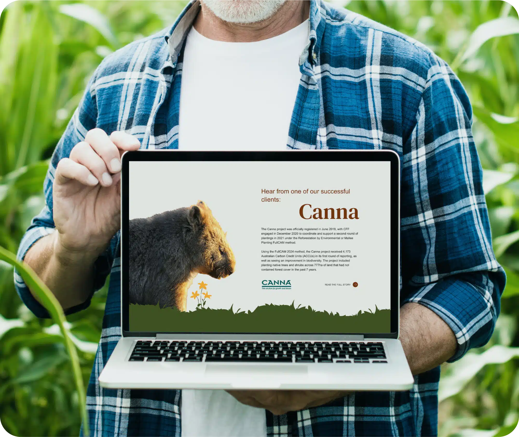
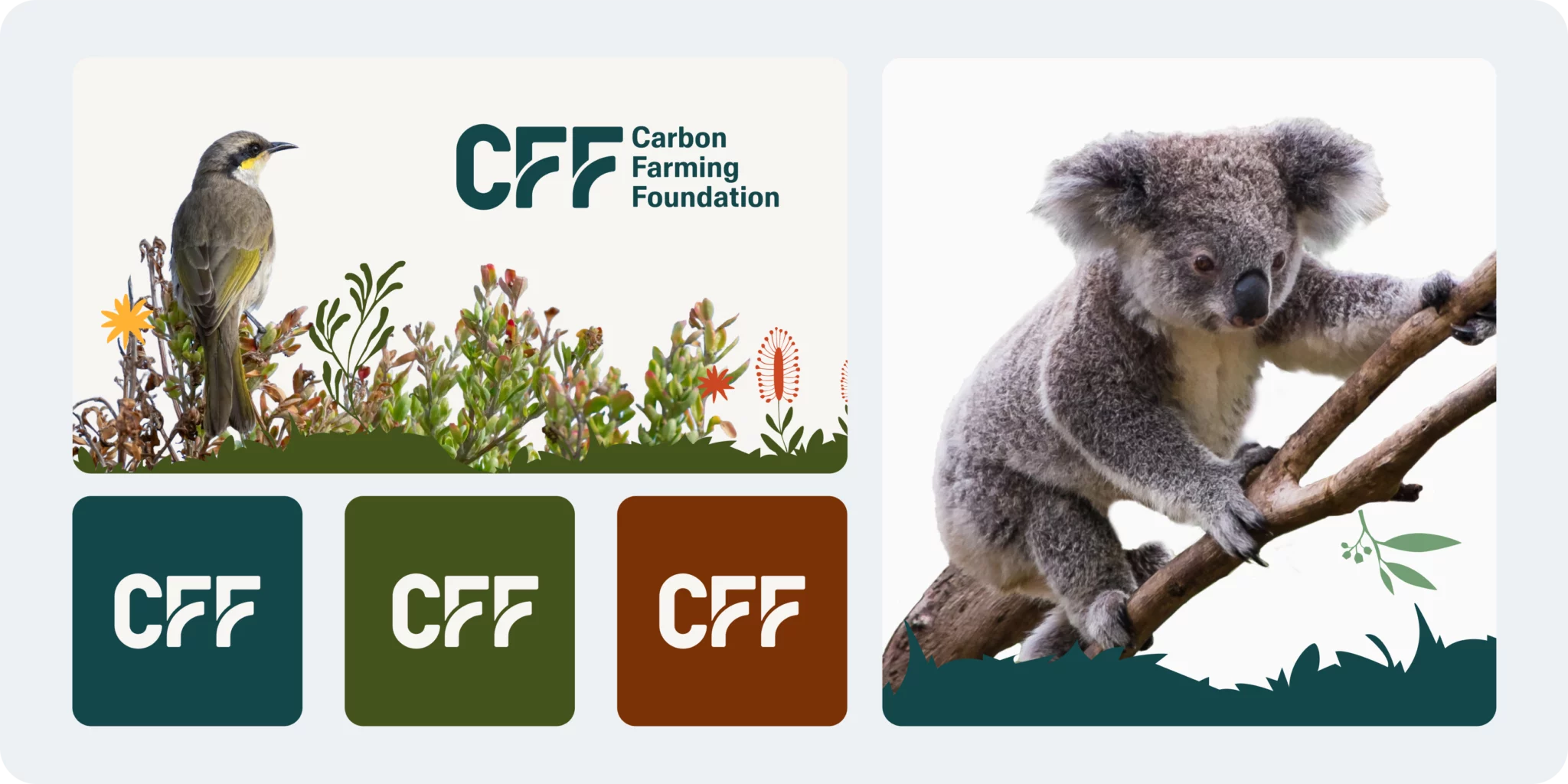
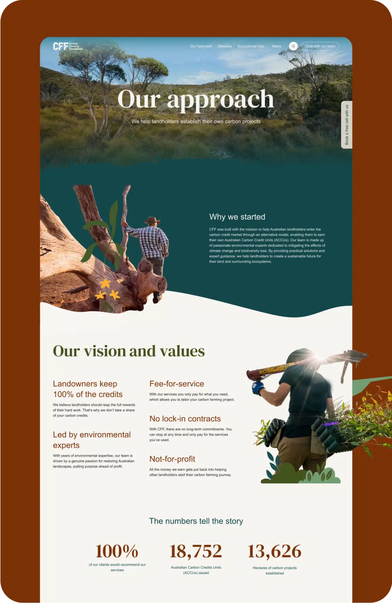
Marcela Moscardini, our Lead Creative for this project, faced the challenge of bringing personality to a constrained brand palette. The solution required both creativity and persistence.
Typography Enhancement While respecting the client’s requirement for Arial body text, we convinced them to incorporate a serif font for headings. This wasn’t just about aesthetics — the serif font added visual hierarchy and improved readability, giving the site character while maintaining brand compliance.
“We had to push back a little because the client was reluctant to change the colours. Using their original palette would have made the text difficult to read.”
Marcela Moscardini, Lead Creative
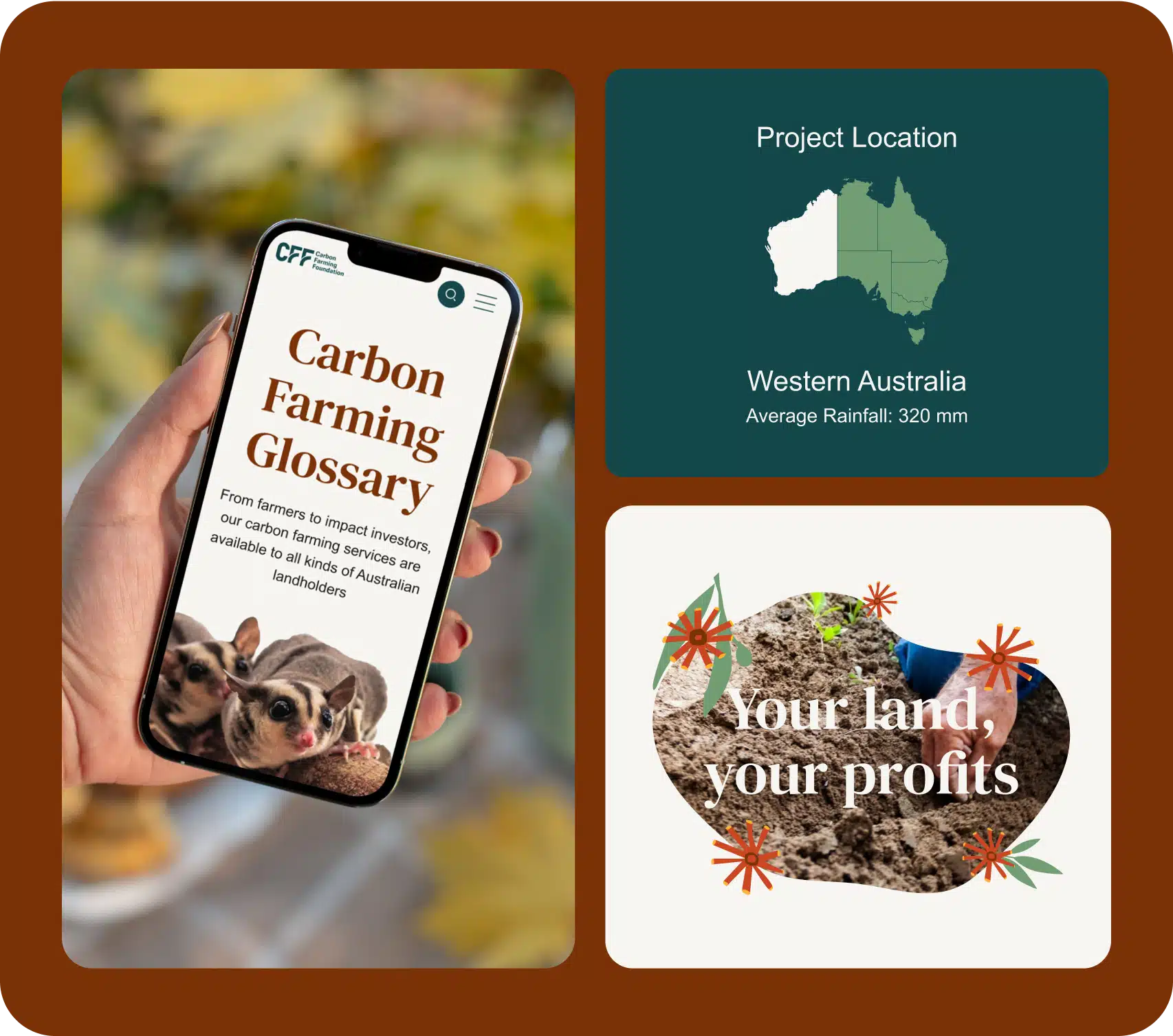
The standout feature became a custom-built interactive map displaying the foundation’s projects across Australia. This was the client’s most significant request — and our biggest technical challenge.
Giang Nguyen, our Front-end Developer, had to create a custom solution from scratch since no existing plugins met the specific requirements:
The map implementation required finding accurate locations for each marker, creating a system that maintained marker positions regardless of screen size, and ensuring interactive elements worked seamlessly across all devices.
“Giang deconstructed the initial framework and engineered a bespoke solution — building on a base but executing significant custom development to meet the precise requirements.”
Aimee Bulaong, Project Lead
The redesigned Carbon Farming Foundation website successfully transformed complex information into an accessible educational journey, created a clear path to consultation bookings, and provided innovative features like the interactive project map.
From a field of over 300 submissions judged by a panel of 50 industry experts, our work stood out for its combination of creativity, technical innovation, and user focus — earning recognition as Winner of the Australian Web Awards 2025 in the Not-for-Profit category.
