When DTS Commercial approached Spark, they were already servicing large-scale fleets and industrial clients across Queensland — but their brand still looked like a small-town service centre. They needed a clearer identity, one that reflected the scale of their work and positioned them for major commercial contracts.
The Challenge: Looking the Part
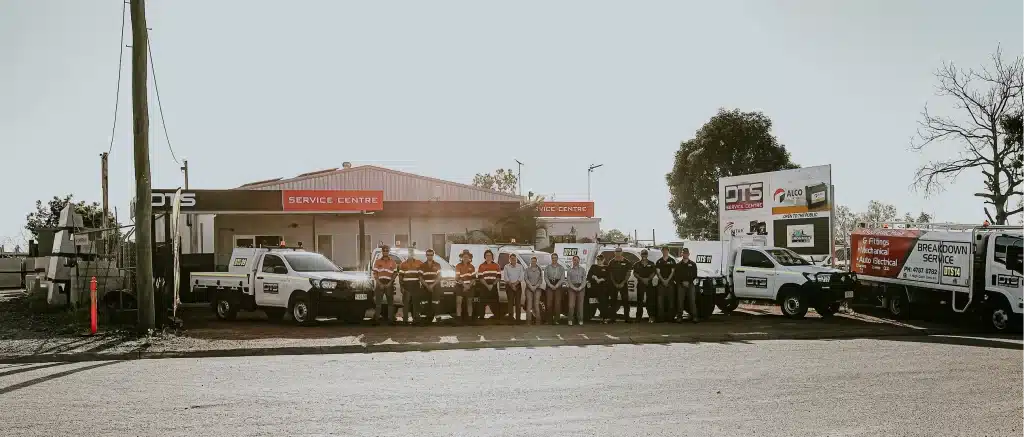
DTS had built a solid reputation as a local service centre — the kind of place you’d take your car when something went wrong. But that wasn’t the full picture. Behind the workshop doors, they were servicing massive fleets, fixing generators, and keeping earthmoving equipment running across remote sites in Queensland.
“It looked like a small mechanic business, but they were already working on big machines for big clients. They needed a fresh look for the commercial side of the business, one that would be linked to, but separate from, the Service Centre local residents were familiar with.”
Kath, Creative Director
With long-term infrastructure and mining contracts on the horizon, DTS needed to act fast. They weren’t just trying to look more professional — they needed to prove they could handle serious commercial work, and do it at scale. The problem? No photos to show it. No real messaging around it. And a brand still rooted in the service centre side of the business.
It wasn’t just about a new look. It was about helping DTS confidently say: we do more than you think — and we’re ready for what’s next.
How We Brought the Brand to Life
1. Building the Brand: Identity, Messaging & Direction
When DTS first approached us, they weren’t looking for a complete overhaul — they were looking for clarity. The team had just decided to separate their commercial work from the original DTS Service Centre, and they needed help shaping that new identity.
“They wanted it to feel connected to the service centre but more polished — more corporate,” Kath said. “Their old logo had lots of chrome and gradients, which didn’t really translate across different applications.”
Ben led the development of the brand voice and tagline, working closely with Kath to ensure the visuals matched the tone. Instead of abstract messaging, the tagline we created spoke directly to what DTS actually did — and what their clients needed:
“We keep you RUNNING. GROWING. DIGGING. HAULING. MOVING. LIFTING. PRODUCING. BUILDING.”
This direct, list-style approach worked because it skipped the fluff and mirrored the urgency of their work — a service that operates 24/7 to keep vital machinery moving.
Visually, we introduced a bold industrial typeface and a vibrant blue drawn from their actual uniforms. Arrow elements throughout the design created a sense of momentum, while the overall structure remained clean and versatile enough to use across print and digital.
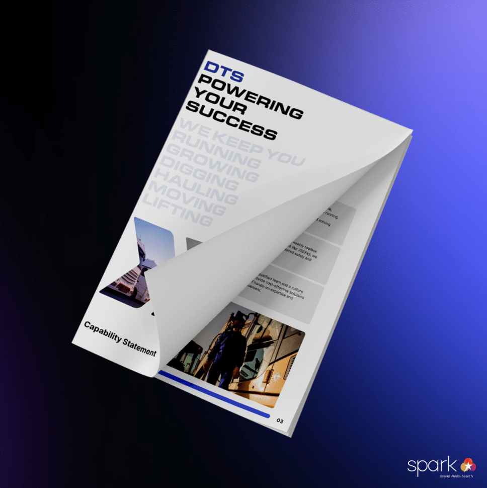
2. Laying the Foundation: Capability Statement as the First Expression
With the brand direction in place, the Capability Statement became our first opportunity to put it into practice. While Kath refined the visual system and Ben shaped the voice, I focused on translating it all into content that could speak directly to DTS’s future clients. With the messaging locked in and visual assets ready, everything started to click — it was now about structuring the content in a way that felt clear, confident, and true to who they were.
We weren’t just listing services — we were positioning DTS as a commercial operator that understood the needs of high-stakes industries. The Capability Statement set the tone for everything that followed, including the website.
Key elements included:
- A concise brand story that positioned DTS as a responsive, experienced, 24/7 operation
- Clear service breakdowns across mechanical, electrical, hydraulic and fleet maintenance
- Visual consistency with the new brand identity — from layout to colours and typography
- A direct, urgent tone that mirrored the nature of their work
This document became a foundational tool for conversations with contractors, mining operators, and infrastructure firms — many of whom needed assurance that DTS could deliver at scale.
Related article: Thought Leadership and Social Media Strategies for Civil Firms
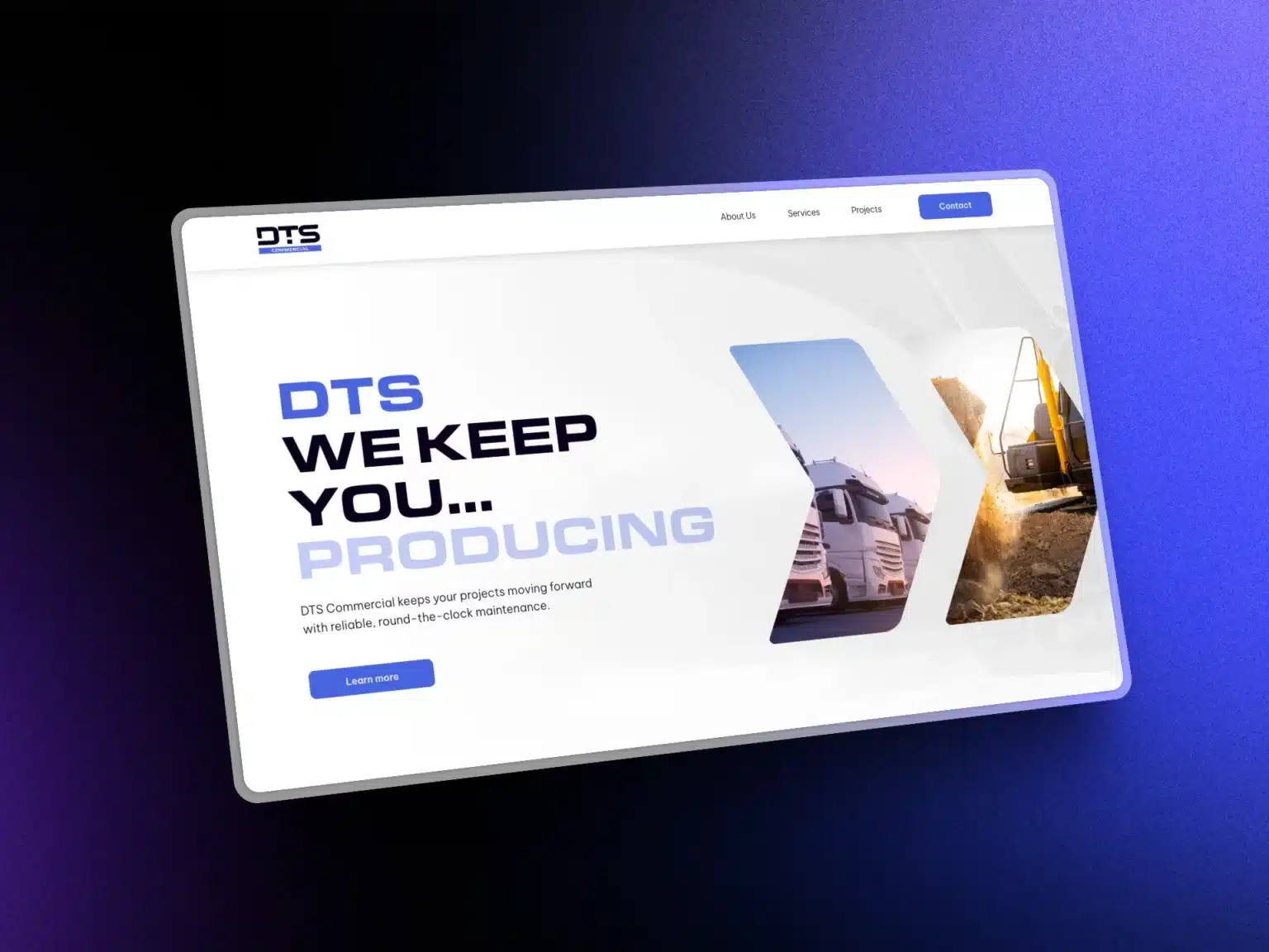
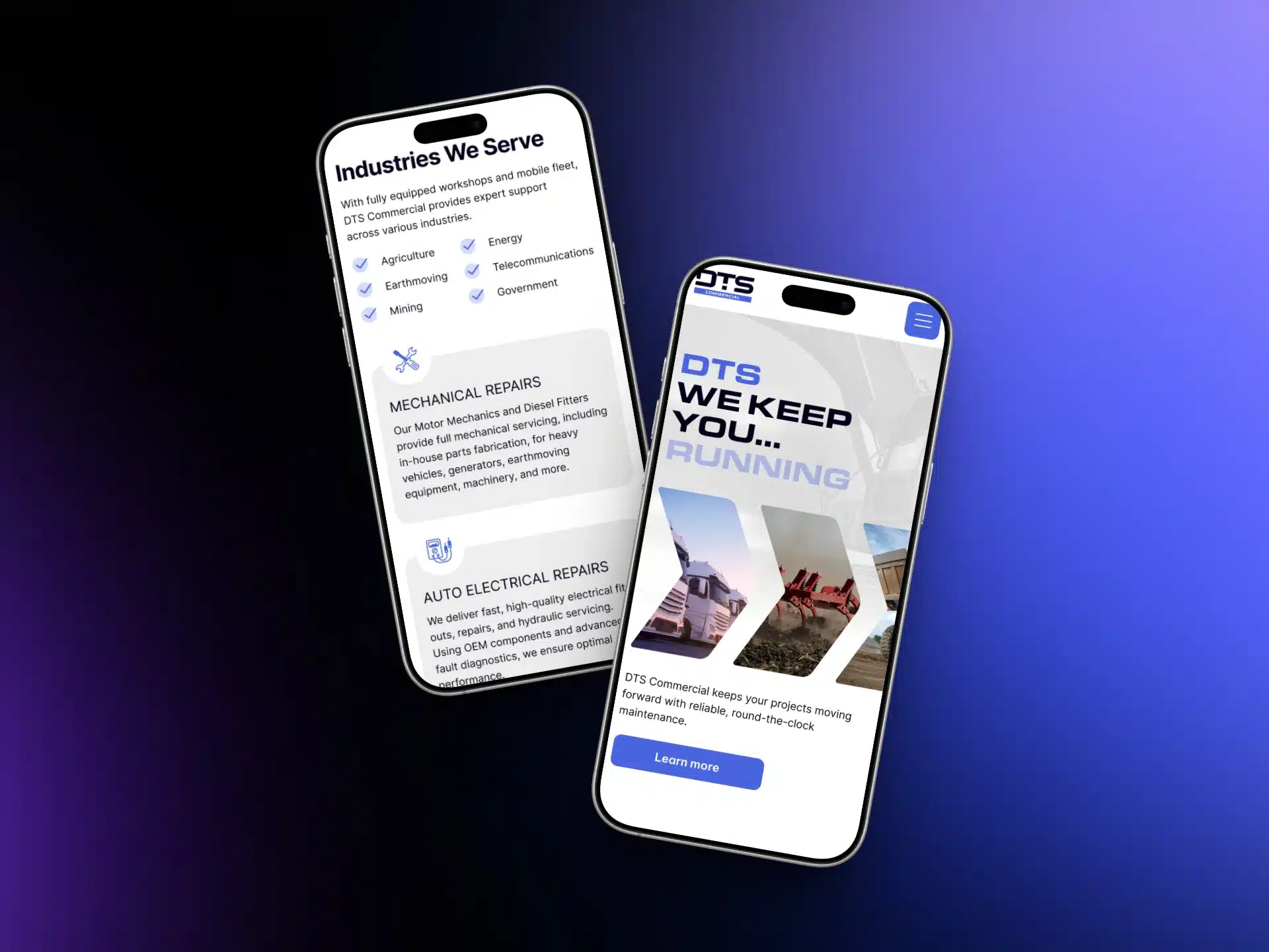
3. Going Live: Translating the Brand to a Digital Experience
With the Capability Statement already doing the heavy lifting in client conversations, the next step was bringing the DTS Commercial brand online. The goal: a professional, easy-to-navigate site that reflected their scale and reliability — without needing endless pages or over complicated design.
“It’s a five-page site, but it carries the weight of something much bigger. We wanted it to feel clean, strong, and intentional — like the business itself.”
Kath, Creative Director
We designed the site structure to mirror the Capability Statement — which meant the groundwork was already laid. From there, content and design came together quickly: subtle animations added movement without distraction, and the service pages were written to speak directly to commercial clients under time pressure.
To make the most of a lean site, we focused on:
- A clear layout based on service categories and industry sectors
- Stock photography selected to imply scale and capability, despite limited client assets
- Subtle scroll animations for a smoother, more modern user experience
- Responsive design across mobile and desktop
- SEO optimisation tailored to location- and service-based search terms
The result was a professional digital presence that matched the real-world capability of DTS — fast, reliable, and ready for serious work.
The Outcome: A Brand Ready for Big Contracts
What started as a simple logo brief turned into a full repositioning for DTS — from a small-town service centre to a credible, capable operator ready to win long-term infrastructure and mining contracts. “They were already doing the work,” Kath noted. “They just needed a brand that showed it.”
Between the branding, capability statement, and website, DTS Commercial now had a foundation they could confidently present to serious commercial clients. The look matched the service. The message was clear. And the digital presence gave them the visibility and credibility they needed to move forward.
What made the project work wasn’t just the output — it was the process:
- Starting with a clear brand voice and visual direction
- Aligning content, design, and structure across every touchpoint
- Collaborating closely across design, copy, and development from day one
Now, with future contracts on the horizon, DTS Commercial has more than a new name — they have a brand that’s built to grow with them.
Thinking about where your brand could go next?
Whether you’re refining your message, repositioning your business, or just trying to look like the company you already are — we can help. Get in touch with Spark to explore how brand and digital strategy can support your next move.