
 ChatGPT
 Claude
 Perplexity
 Gemini
TL;DR: Mobile-first website redesign prioritises smartphone users by designing for small screens first, then scaling up. Australian businesses typically invest $5,000-$40,000 for professional redesigns, with 73% of Aussie consumers now shopping via mobile. This comprehensive guide covers costs, implementation strategies, and how to choose the right local agency for your mobile-first transformation.
An 8-second delay on mobile is all it takes for a customer to abandon your site and choose a competitor. In today’s market, that lost click could mean a lost sale.
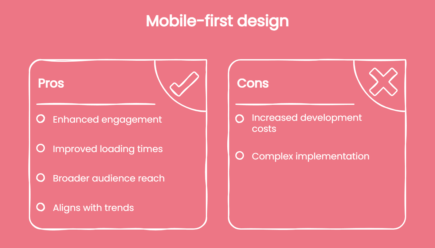
Mobile-first website redesign is no longer optional. It reshapes the way businesses connect with their audience by prioritising the experience on the devices people use most. With mobile driving over 60% of Australia’s web traffic, the difference between a site that loads quickly and one that doesn’t is the difference between winning and losing customers.
What Is Mobile-First Website Redesign?
Ever wondered why some websites look perfect on your phone, while others require you to pinch and zoom endlessly?
Mobile-first website redesign flips traditional web development on its head. Instead of designing for desktop computers and then squashing everything down, you start with the mobile screen — the smallest canvas—and expand outward.
Think of it like building a house. You wouldn’t start with the penthouse suite then try cramming it into a studio apartment, would you?
This approach encompasses:
- Progressive enhancement (starting simple, adding complexity)
- Responsive web design
- Touch-optimised interfaces
- Performance optimisation for 4G/5G networks
Let’s be clear: Mobile-first isn’t the same as mobile-only. Your desktop users still matter—you’re just prioritising the experience for the majority first.
Why Australian Businesses Need Mobile-First Redesign Now
Australians are spending more time and money on mobile devices than ever, and websites that don’t keep up are quickly losing ground. The data shows how significant the shift has become:
- 73% of Australians made online purchases via mobile in 2024
- Google’s mobile-first indexing now covers 95% of all websites
- Mobile page speed affects rankings for 100% of searches
Behind these numbers is a simple truth: customers expect fast, smooth experiences on their phones. If a competitor’s site loads in two seconds and yours takes six, more than half of your visitors will leave before they even reach your homepage.
The change isn’t on the horizon — it has already happened. Businesses that redesign for mobile now are the ones keeping pace with customer behaviour, while those that delay are giving competitors the advantage.
The Real Cost of Ignoring Mobile Users
The price of neglecting mobile isn’t abstract — it shows up in revenue, visibility, and reputation.
- Revenue: Even a one-second delay in load time can cut conversions by up to 20%. For a site turning over $100,000 a month, that’s $20,000 in potential sales lost simply because customers won’t wait.
- Visibility: Google ranks mobile-friendly websites higher. A poor mobile experience pushes your site down the results page, reducing the number of people who ever see your business online.
- Credibility: Slow, awkward sites don’t just frustrate users — they damage trust. Visitors often associate poor performance with poor service, and many won’t return after a bad experience.
Together, these factors mean that ignoring mobile isn’t just a missed opportunity. It’s an ongoing cost that compounds every day your site underperforms.
Mobile-First Design Principles for Australian Websites
What Makes a Website Truly Mobile-First?
Success starts with understanding these core principles:
1. Content Prioritisation
Strip away the fluff. What absolutely must users see first?
Mobile-first means ruthless prioritisation. Your value proposition, call-to-action, and key information take centre stage. Everything else? It can wait.
2. Thumb-Friendly Navigation
Remember: thumbs do the scrolling. Design your navigation, buttons, and interactive elements within easy reach of where thumbs naturally rest.
3. Performance Over Polish
A beautiful site that won’t load is worthless.
Optimise images, minimise code, leverage browser caching. Your goal? Sub-3-second load times on 4G networks.
4. Progressive Disclosure
Don’t overwhelm users with everything at once.
Start with essential information. Let users choose to dive deeper through expandable sections, tabs, or additional pages.
Australian Accessibility Standards Matter
A mobile-first redesign should be easy to use for everyone. That includes features like:
- Readable fonts (minimum 16px base size)
- Sufficient colour contrast (WCAG 2.1 AA standard)
- Touch targets at least 44×44 pixels
- Screen reader compatibility
These improvements don’t only help people with disabilities — they make websites clearer, faster, and more user-friendly for all mobile visitors.
Accessibility also comes with a legal obligation in Australia. Under the Disability Discrimination Act 1992, businesses are required to make digital services accessible. Ignoring these standards can result in complaints or even legal action.
By addressing accessibility as part of a mobile-first redesign, businesses not only stay compliant but also show they value inclusivity and create a better experience for every customer.
Budgeting for a Mobile-First Redesign in Australia
A mobile-first redesign is a significant investment, and the right budget depends on the size and complexity of your site. While costs can vary widely, most Australian businesses will fall into three tiers.
Typical Costs
Smaller websites — such as cafés, trades, or local services with 5–15 pages — usually sit in the $5,000–$15,000 range. At this level, you can expect a responsive web design, basic SEO, and standard functionality that ensures your site looks and performs well on mobile.
For medium-sized businesses with 15–50 pages, the investment often ranges from $15,000–$30,000. These projects typically involve more complex requirements, like integrating booking systems or adding full e-commerce capabilities.
Larger organisations managing enterprise-level websites (50+ pages) should budget $30,000–$40,000+. These builds often demand custom development, multiple third-party integrations, and rigorous testing across devices.
Additional Expenses
The design fee is only part of the picture. Businesses should also account for content migration, preserving SEO during the transition, and ongoing maintenance. For example:
- Content migration can cost $1,000–$5,000
- SEO preservation ranges from $2,000–$8,000
- Maintenance typically costs $200–$1,000 per month
- Performance monitoring tools add another $50–$300 per month
It’s smart to set aside an extra buffer of around 20% on top of quotes. This ensures you’re prepared for unexpected requirements that often surface once a project is underway.
Return on Investment
The upside is that most businesses recover these costs quickly. Many see positive ROI within six to twelve months. Take one Melbourne retailer who invested $25,000 in a mobile-first redesign: within weeks, they saw a 47% increase in mobile conversions, a 32% drop in bounce rate, and an extra $18,000 in monthly revenue. Their redesign paid for itself in just six weeks.
In short, while the price tag may seem daunting, the payoff from a faster, more user-friendly mobile site often comes far sooner than expected.
Choosing the Right Australian Web Design Agency
Not every web design agency truly understands mobile-first development. Some may deliver a site that looks fine on desktop but falls short on smaller screens. To avoid costly mistakes, it’s worth knowing what separates reliable partners from those who only claim to specialise in this space.
What to Look For
A strong agency will have a portfolio that demonstrates more than just template-based sites. Look for examples of progressive web apps (PWAs) and case studies that show measurable improvements in conversions or performance. Certifications such as Google Partner status can also give you confidence in their technical expertise. Most importantly, the agency should show an understanding of Australian consumer behaviour and accessibility standards, not just global best practices.
Questions Worth Asking
Before signing any contract, ask direct questions that reveal how they actually work:
- How do you manage performance budgets?
- What’s your approach to mobile SEO?
- Can you share analytics from past projects?
- How do you test across different devices?
- What post-launch support is included?
Agencies that can answer these clearly — and back them up with evidence — are more likely to deliver a site that performs well long after launch.
Local vs International
While offshore developers can appear cheaper at first glance, they often introduce hidden costs in time and revisions. Local agencies, on the other hand, tend to deliver projects 40% faster and require far fewer rounds of rework. They’re also better equipped to handle local SEO, Australian compliance standards, and can meet face-to-face if needed. For most businesses, these advantages far outweigh the initial savings from going offshore.
Choosing the right partner isn’t just about the lowest quote — it’s about ensuring your website is built for long-term performance and customer experience.
Mobile-First Redesign Process: Step-by-Step Guide
A mobile-first redesign doesn’t happen overnight. It follows a structured process that helps businesses move from audit to launch without losing sight of performance. Here’s how most projects unfold:
Phase 1: Discovery and Audit
Every project begins with understanding where you stand. This involves running performance audits using tools like Google’s Mobile-Friendly Test and PageSpeed Insights to benchmark current load times and usability. Competitor analysis also plays a role — what are others doing well, and where are they falling short? Finally, customer feedback is crucial. Surveys can reveal what frustrates users most about the current mobile experience.
Phase 2: Strategy and Planning
Once the baseline is clear, the planning stage sets the direction. Information architecture is mapped out with mobile navigation in mind — what deserves the prime “thumb estate”? A performance budget is then set, usually targeting under 500KB for homepages and load times below three seconds. Content is reviewed to decide what stays, what goes, and what needs rewriting for easier mobile consumption.
Phase 3: Design and Prototyping
This is where ideas take shape. Designers create mobile wireframes first, usually at 375px width, ensuring the site works on the smallest screens. From there, layouts expand to tablet and desktop. Interactive prototypes allow for user testing before development begins, which keeps costs down and ensures usability issues are fixed early.
Phase 4: Development
With approved prototypes, the build begins. Developers write mobile-first CSS, progressively enhancing layouts for larger screens. Performance techniques like lazy loading, compression, and caching are implemented to keep the site fast. Testing across multiple real devices — from iPhones to Android tablets and desktops — ensures consistency and reliability.
Phase 5: Launch and Optimisation
A good launch is gradual. Many businesses start with a soft launch, releasing the site to a portion of traffic while monitoring performance. SEO migration steps — such as 301 redirects, updated sitemaps, and notifying Google — help preserve search visibility. From there, dashboards track Core Web Vitals, conversions, and user flows to fine-tune the experience.
Conclusion
Mobile use has already overtaken desktop in Australia, and businesses that don’t adapt are losing customers every day. A mobile-first redesign isn’t just about appearances — it directly impacts speed, usability, and revenue.
With a clear strategy and the right partner, the investment pays off quickly. At Spark, we design websites that work beautifully on every device and deliver results where it matters most: conversions and customer experience.
If your site isn’t performing on mobile, now is the time to start.